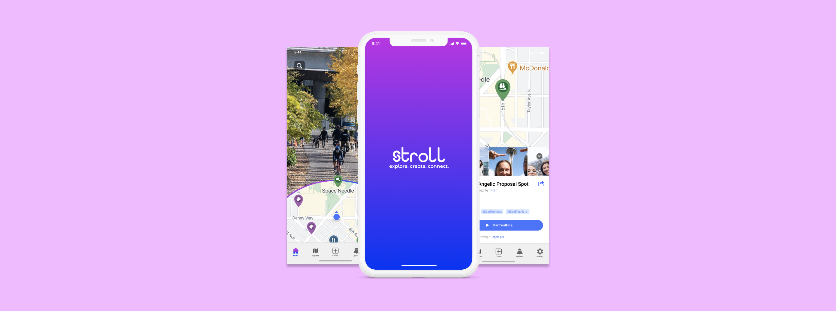
Stroll
A mobile app that turns your neighborhood into a travel experience
Overview
For many of us, the COVID pandemic put a wrench in our travel or vacation plans *face palm*. However, that hunger to do — remotely, anything — was giving us an excuse to take a simple walk or bike ride around the neighborhood.
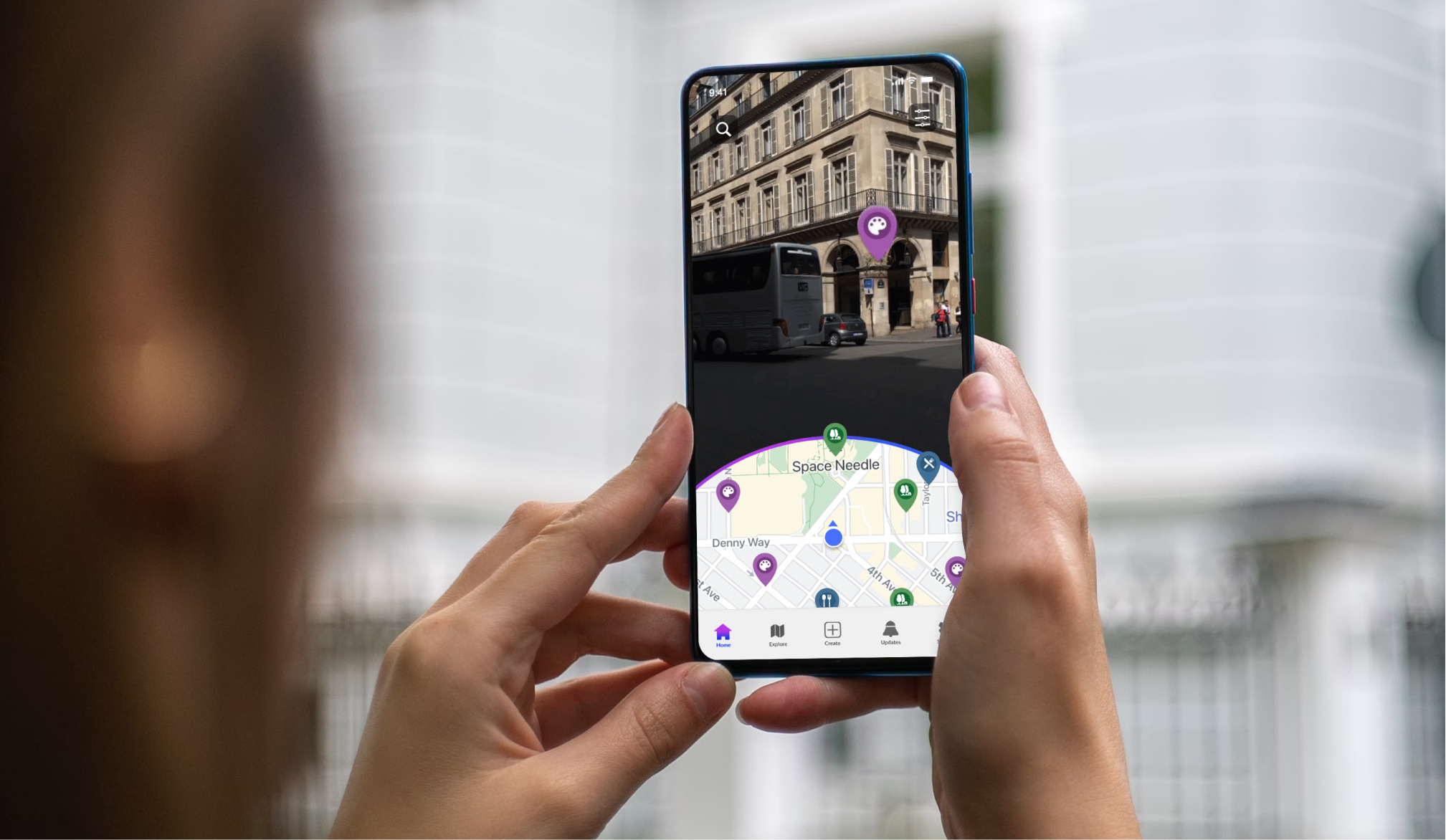
With Stroll, we investigated how to make daily walks more exciting and fulfilling. Our app gives people the ability to explore neighborhoods through Augmented Reality (AR) while sharing their own unique experiences and building a stronger sense of community. For 9 weeks, I collaborated with my team (via Zoom) to research, ideate, design, and prototype the Explorer and Creator features on the Stroll app.
Team
- Beth Dunbar, UX Researcher
- Elisabeth Fonden, UX Designer
- Kallie Bracken, PM
- Anders Herberg, UX Designer
Duties
- UX Design
- User Research
- Interaction Design
Time
- Sept 2020 - Dec 2020
Challenge and Research
We began our project by asking how we can utilize technology to promote neighborhood exploration, encourage physical activity, and create stronger connections between people and their communities during quarantine?
To answer our question, 18 participants completed Diary Studies and Surveys, and we conducted a Competitive Analysis of three exploration-style applications to discover how we can improve neighborhood exploration. We found most users felt getting outside for a walk was beneficial to their mental health, they go for walks in their neighborhood on a weekly basis, and wish they felt more connected with the local community. Additionally, we discovered users leverage multiple apps and websites to explore their neighborhood and events.
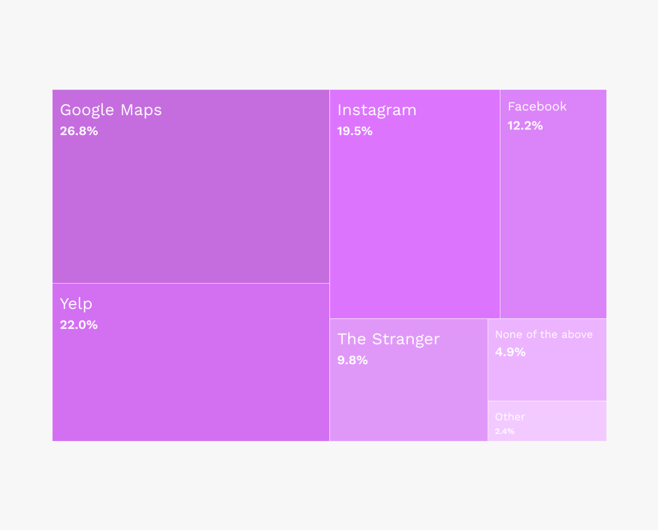
Breakdown of how users explore their neighborhood
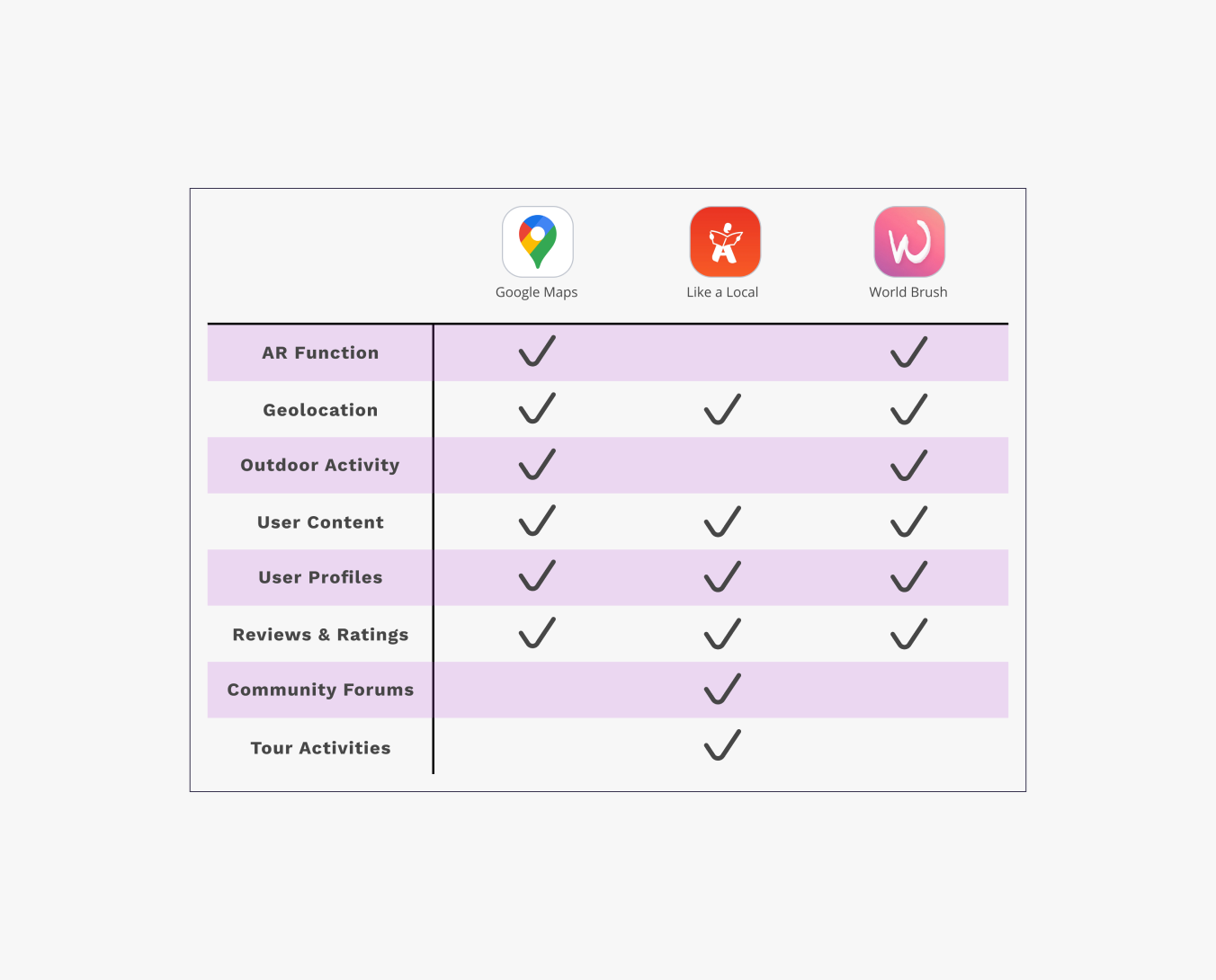
Competitive analysis helped us identify gaps in popular applications
Synthesis
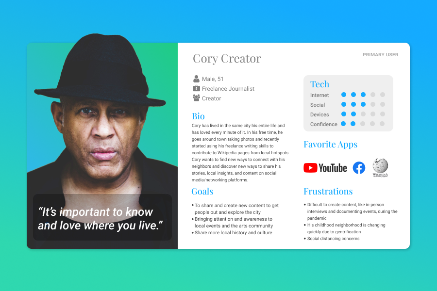
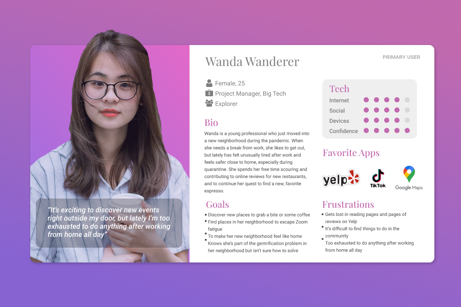
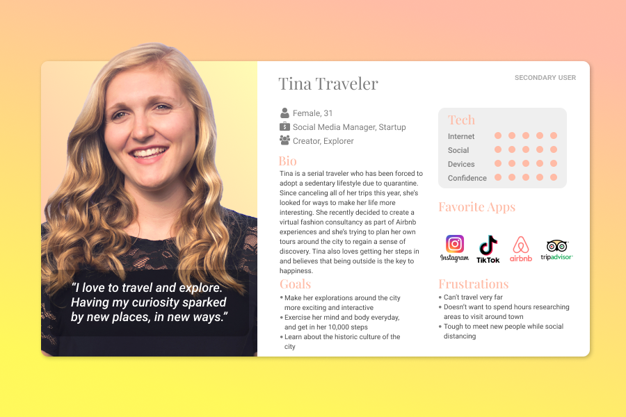
After reviewing our research, we created multiple primary and secondary user personas to highlight key behaviors we anticipated from our users. Based on our research, we created Wanda Wanderer to be our primary user persona since all of our participants enjoyed wandering their neighborhoods and discovering new points of interest.
Design Ideation
Our synthesized design vision determined that Stroll should foster a sense of belonging by helping people feel more connected to their community, should encourage users to get outside in support of physical and mental wellness, and help users, who are passionate about their community, to easily create and share content.
We used our insights to sketch user interactions and storyboards to document journey flows, then compiled our designs and began wireframing our application for usability testing.
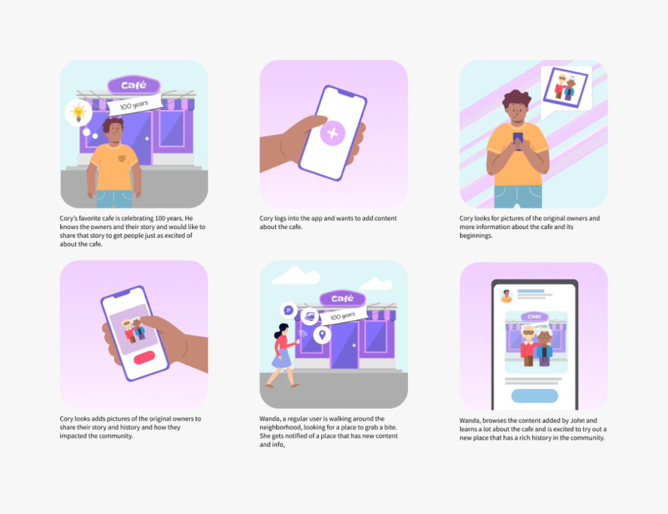
Storyboard of Cory Creator to outline users who want to add content to the application
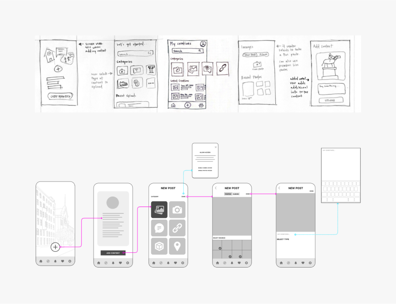
Sketches and lo-fidelity flows of the creator journey
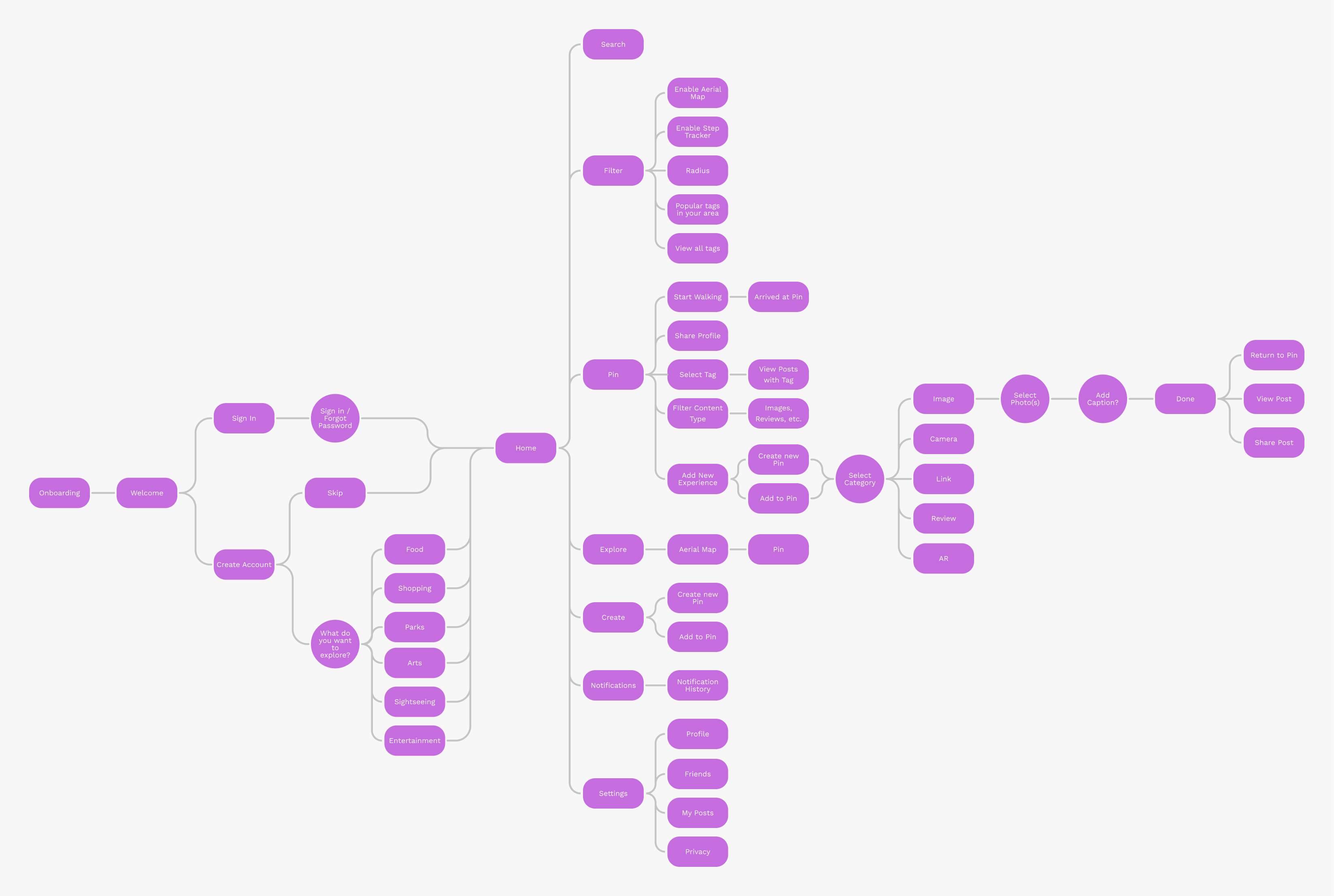
Stroll’s Information Architecture and Journey Flow
Rapid Prototyping
Due to our tight deadline, we went straight into mid-fidelity prototyping to get ready for usability testing. I developed wireframes and prototypes for three of our key features: the home page, onboarding, and adding content to a Pin — a point of interest that users can interact with. The idea behind the home page was that it activated the device’s camera to be an AR lens to the world in front of you, as well as including a map to see where you are in perspective to nearby Pins.
I was also responsible for quickly creating Stroll’s style guide and design system to immediately produce mid- to hi-fidelity prototypes.
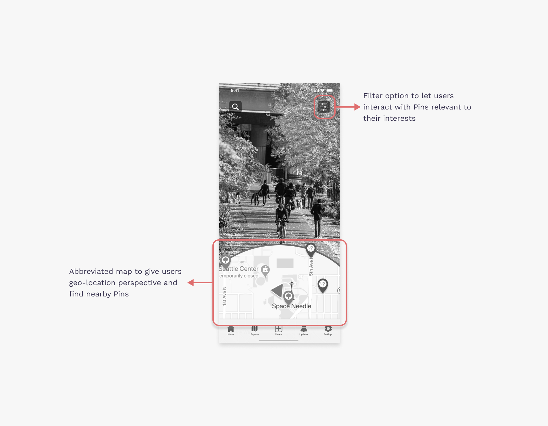
Easy to use and navigate UI when users begin their Stroll experience
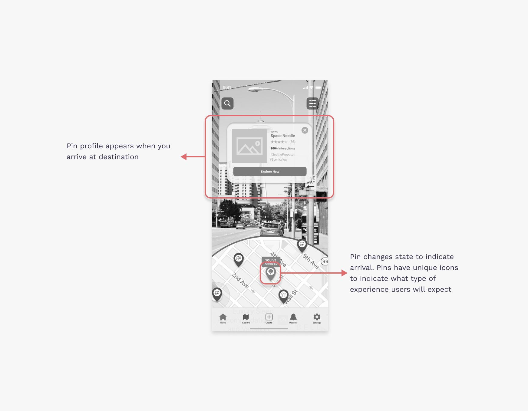
Arriving to your next destination when exploring your community
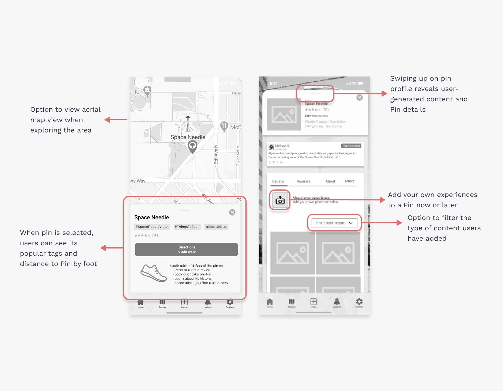
Learn more about the experience that your neighbors have in your community
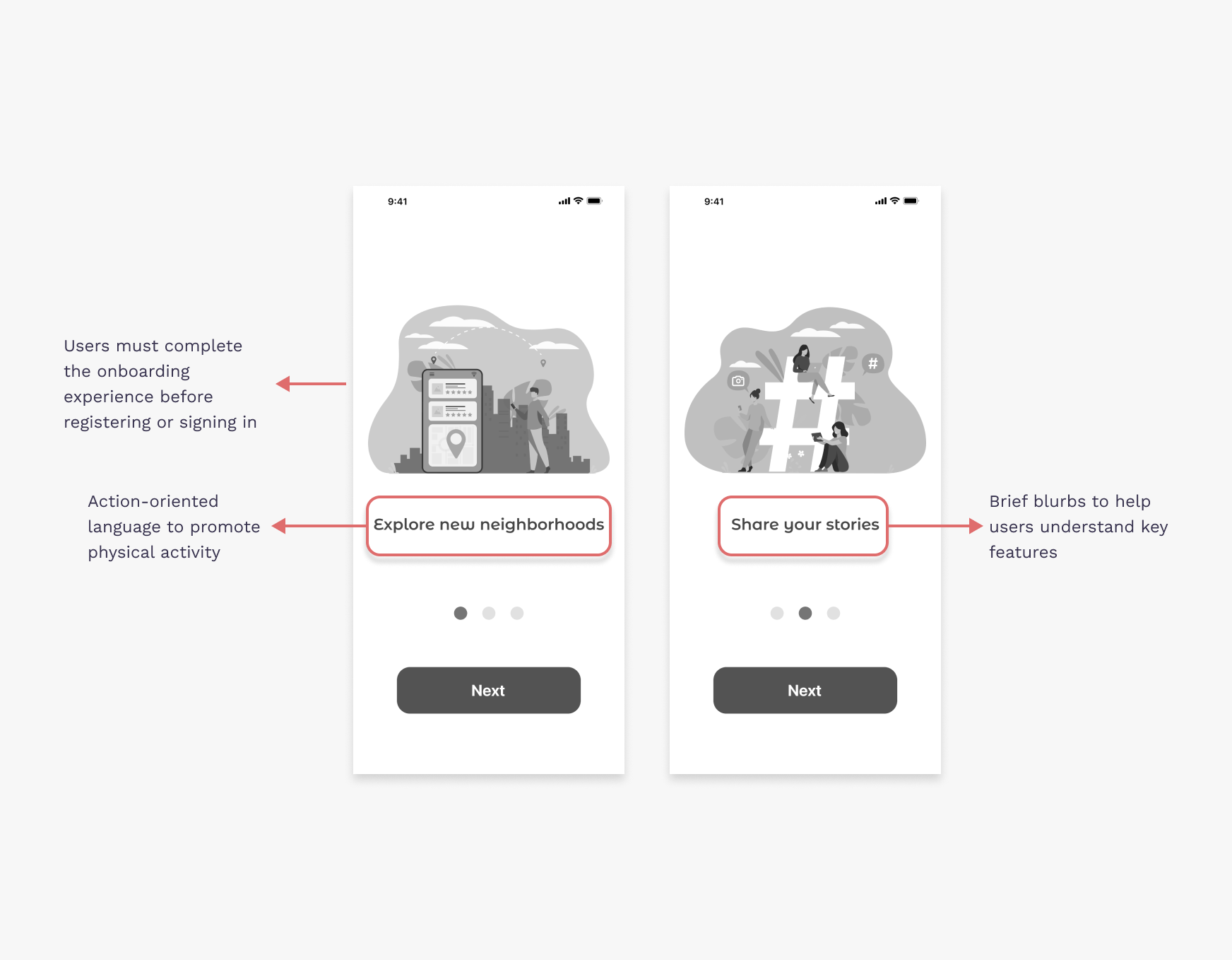
Stroll is simple and easy to use so you can start sharing what you love about your neighborhood
Final Design
Following our usability studies, we refined our designs, incorporated our visual system, then developed our final prototypes.
The final iteration helped bring Stroll’s purpose to life, letting users explore their neighborhood while building a stronger connection with the community. Users get to share their unique facts and places that are meaningful to them and discover new places that have meaning to others. Additionally, users get to discover hidden gems in the community via Augmented Reality, scanning their phone around the area to reveal Pins right in front of them they wouldn’t have noticed otherwise.
Feedback from our prototype was generally positive. We redesigned location identifiers to improve body orientation detection, as well as provide a way for users to escape the AR view and browse an aerial map that’s more familiar. We also included clearer CTA language so users could better interact with Pins by filtering content and adding their own.
Additionally, we identified a fundamental flaw in our onboarding experience. Users had difficulty both with the original UI and when reviewing the tutorial, which left them with many questions once arriving at the homescreen. We alleviated this by incorporating subtext and leveraging a swipe motion rather than a button to prevent users from quickly “tapping” through the tutorial.
User onboarding
Home page
Explore pins
Add your own content
Takeaways
Our team took a big leap with Stroll and designed a product with AR functionalities. Even more so, it was challenging creating a social networking product that was unique, COVID-friendly, but also something that people would use once the pandemic was over.
As a designer, I learned a lot about saving artifacts, UX research, and working with other designers. Most of my design experience had been solo projects, but with Stroll I had the opportunity to work with another designer and build a line of communication so our designs were consistent and seamless. Moreover, as a designer, it was a humbling experience working with users to understand how they use applications so I can best reiterate a design that is more universal and intuitive to someone other than me.