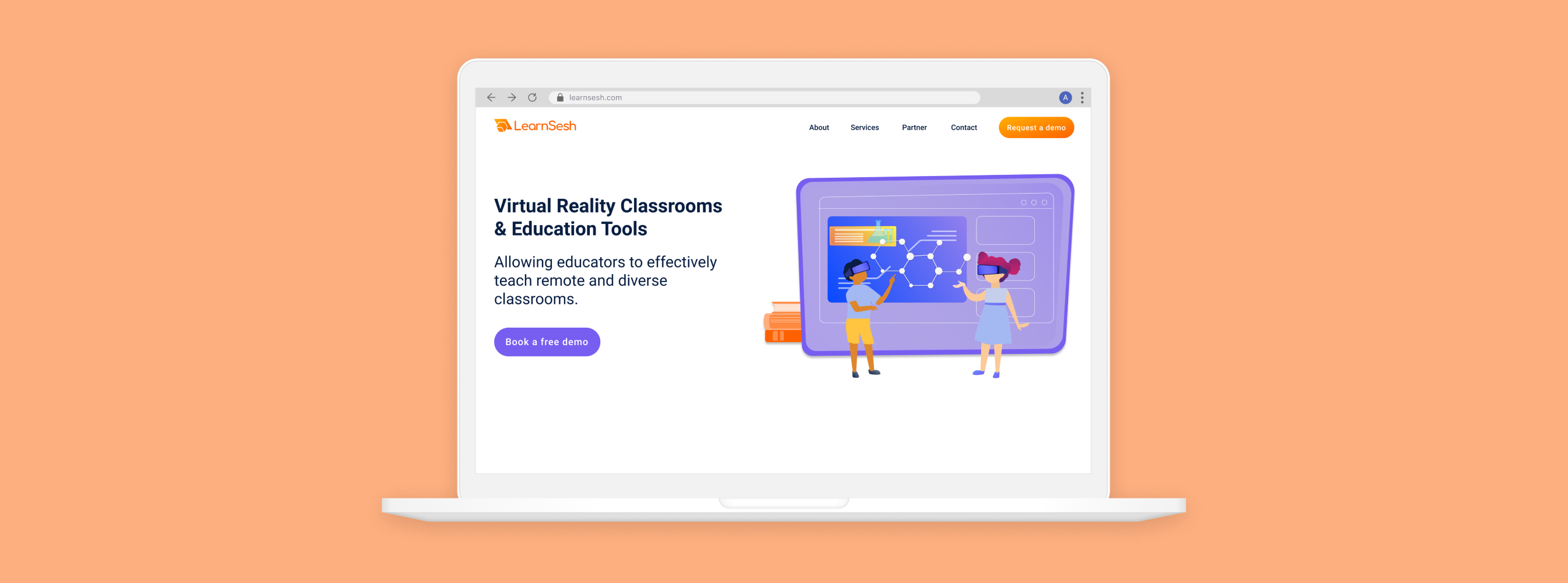
LearnSesh
Creating a new brand identity and website for a VR startup
Overview
One day, I saw a post on Imgur about someone who left their job to pursue their startup. Inspired by their story — and in need of design experience — I reached out to offer my services for whatever design needs they had, and they tasked me with all their visual and web design projects.
LearnSesh, is an EdTech startup, focusing on VR tutoring tools for K-12 students. I rebranded the company, created a design system foundation, and designed/launched their new website. My work included logo design, a lot of surveys to get branding feedback, wireframing, and developing the website in Wordpress.
Team
- Glen Carlisle, CEO
- Anders Herberg, UX Intern
Duties
- Visual Design
- Research
- User Interaction
- Web Design
Time
- Nov 2020 - April 2021

Problem & Research
LearnSesh needed to build a new website to “wow” potential customers and investors. Additionally, they wanted their website to include a new brand identity to freshen-up their appearance. They were beginning to get more visibility by media outlets and investors, so we needed to move quickly to get a new site and brand released as soon as possible.
For my investigation, I first recruited current employees and stakeholders to gather their thoughts about LearnSesh, its mission, identity, and opinions on the current branding. Once I conducted the foundational research, I presented stakeholders with multiple concepts to further identify a design direction, then worked with my coworkers and the Founders to establish the final logo and style guide.
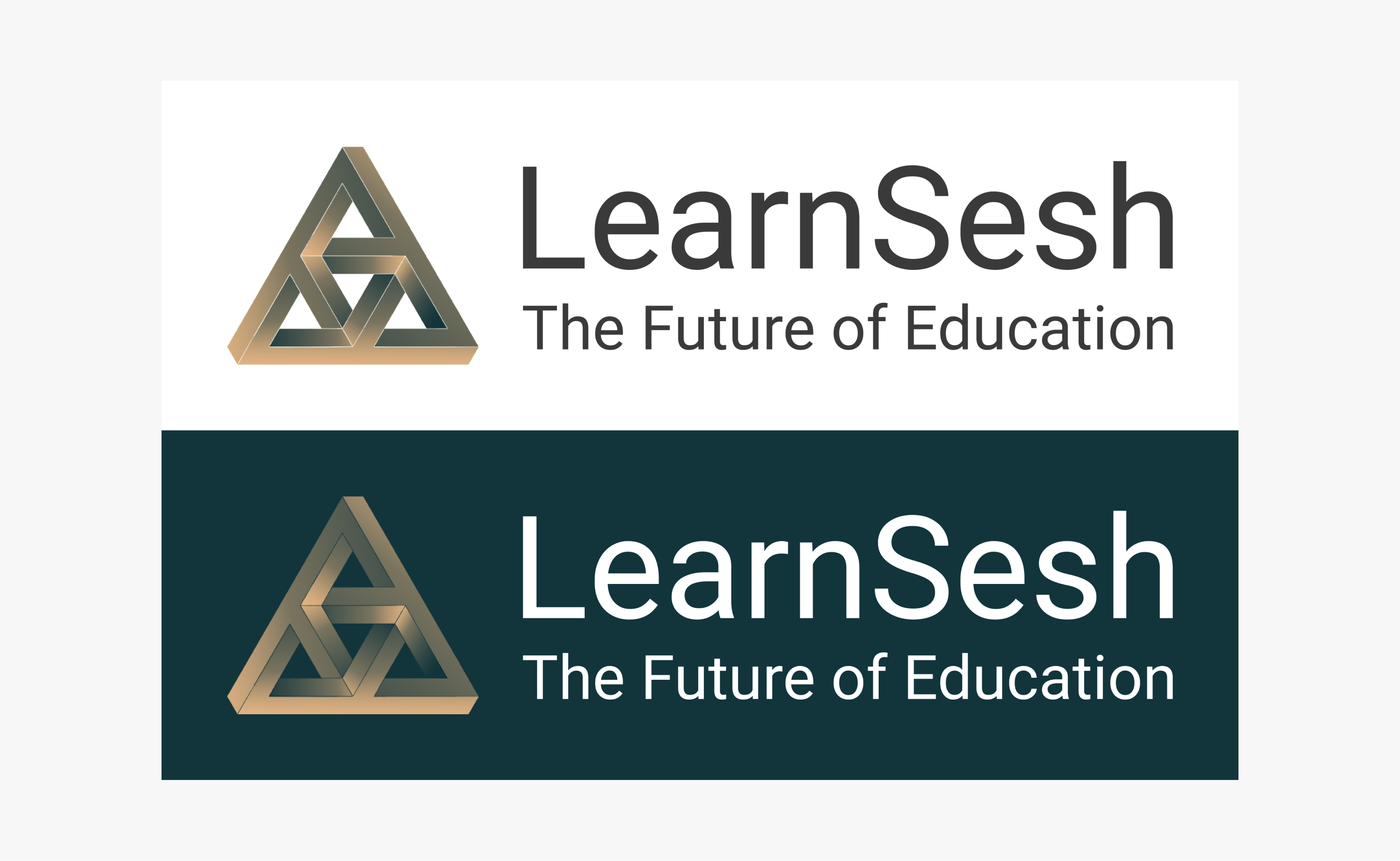
Original branding
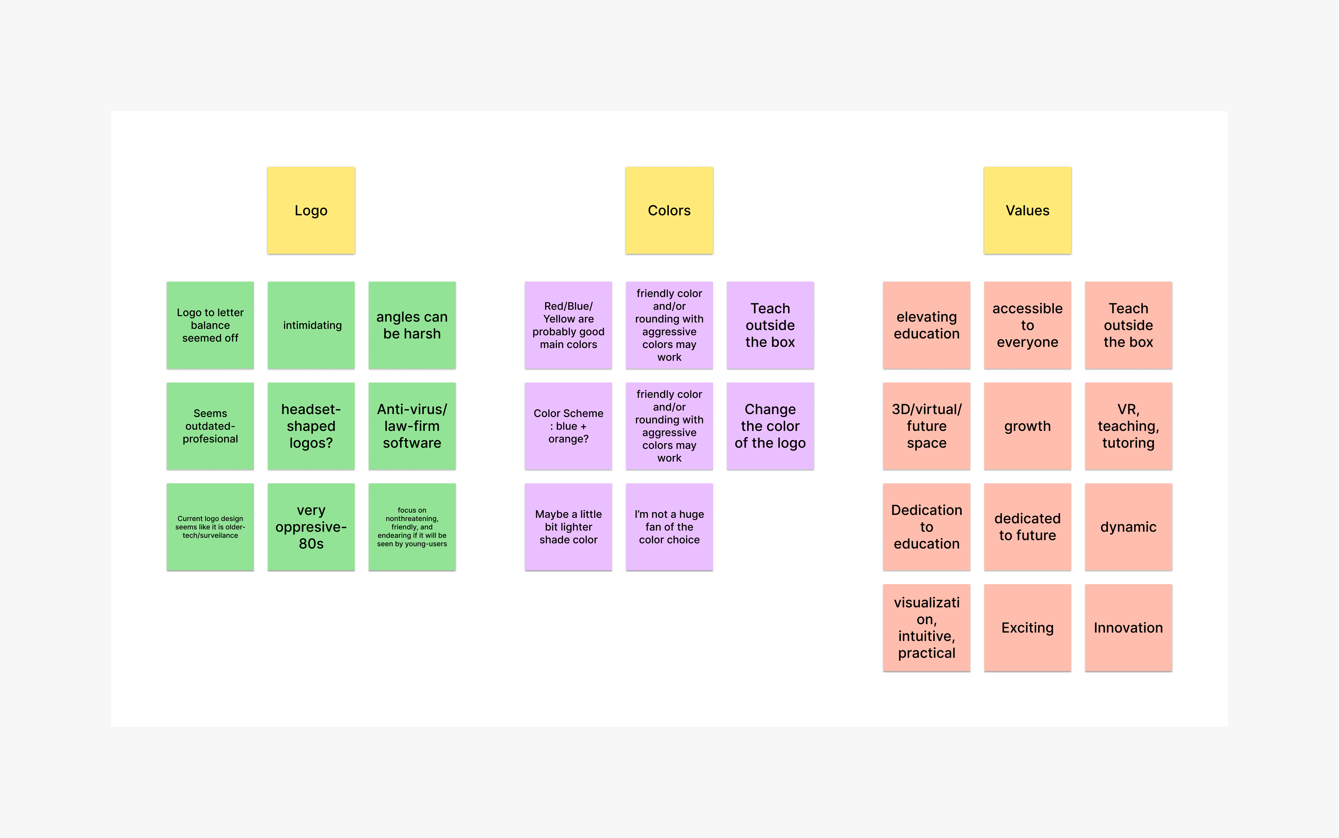
Key insights from participants about current perceptions and opinions of LearnSesh branding
Through my research I identified the logo-type most affiliated with LearnSesh to be a graduation hat. I turned to the LearnSesh team to complete a sketching activity where everyone sketches a graduation hat in 3, 5, and 10 second intervals. I used these sketches to create a set of final logos to survey.
My final questionnaire to stakeholders included four variations of a graduation hat, which they anonymously voted on. Using a combination of the most popular choices and additional opinions about LearnSesh’s mission, we identified the final logo.
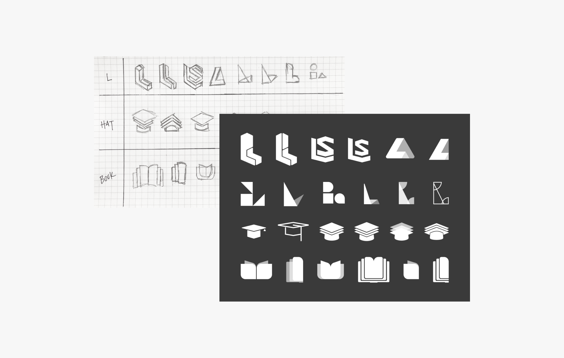
Logo sketches I designed and the versions I presented to stakeholders
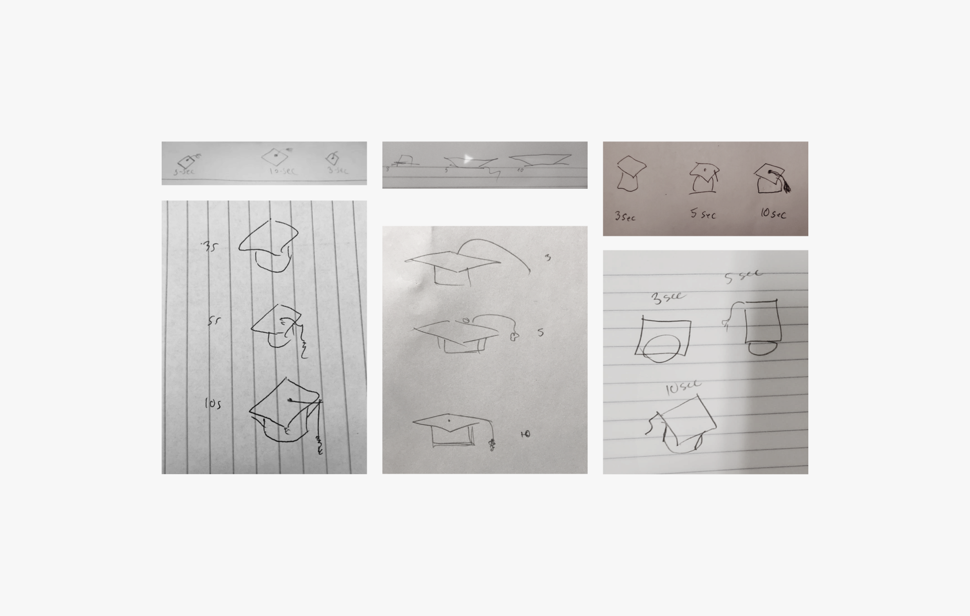
Sketches created by the team during our weekly meeting to help give me some final design direction
Synthesis
My findings from the research gave me enough information to choose a path for both logo and styling. After a final survey to stakeholders, it was clear that they wanted to see a logo that represented both virtual reality and “the future”, along with more approachable, lively colors. The existing design was seen as too “serious” and resembled more of a financial software with its logo and darker color scheme.
Final logo with chosen color palette and typography
Style Guide
The final style guide included all foundational elements of logo, typography, color palette, as well as some design systems elements, including buttons and icons, which were determined after meeting with engineers to determine the best structure and colors for the VR environment.
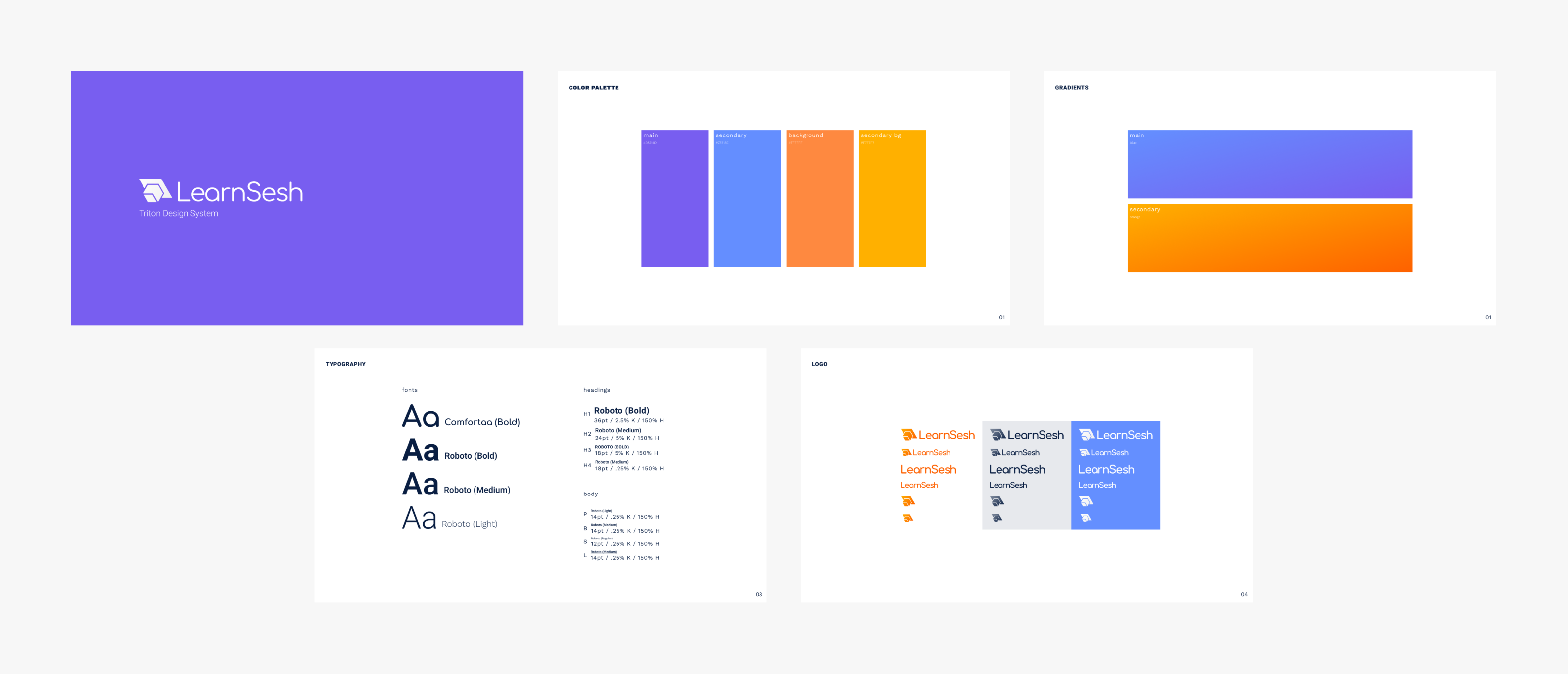
The final design system that offered a fresh, approachable brand identity
Website
With the new brand identity selected, I moved on to the most important task for the business: the website redesign. The site was important to LearnSesh’s business objectives as they were anticipating higher traffic to the site after upcoming features in EdTech news articles. I had two weeks to complete and implement my design, so I jumped straight into mapping the information architecture and wireframing.
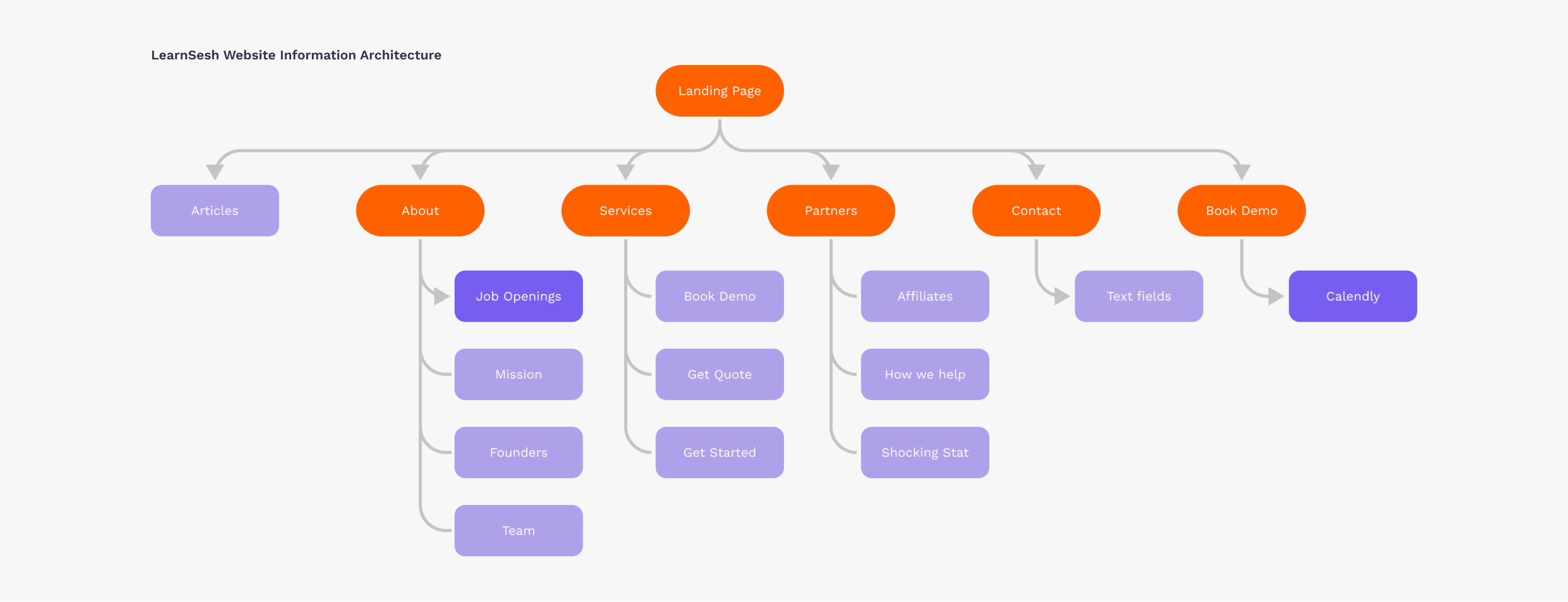
My final task was to design the five pages outlined in the information architecture
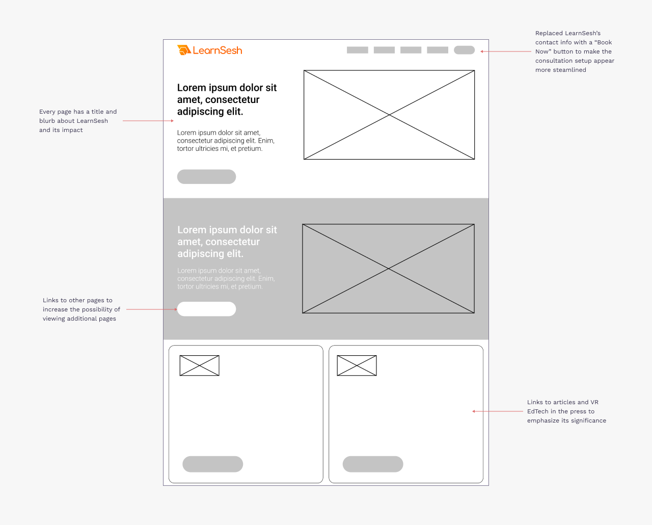
Landing Page
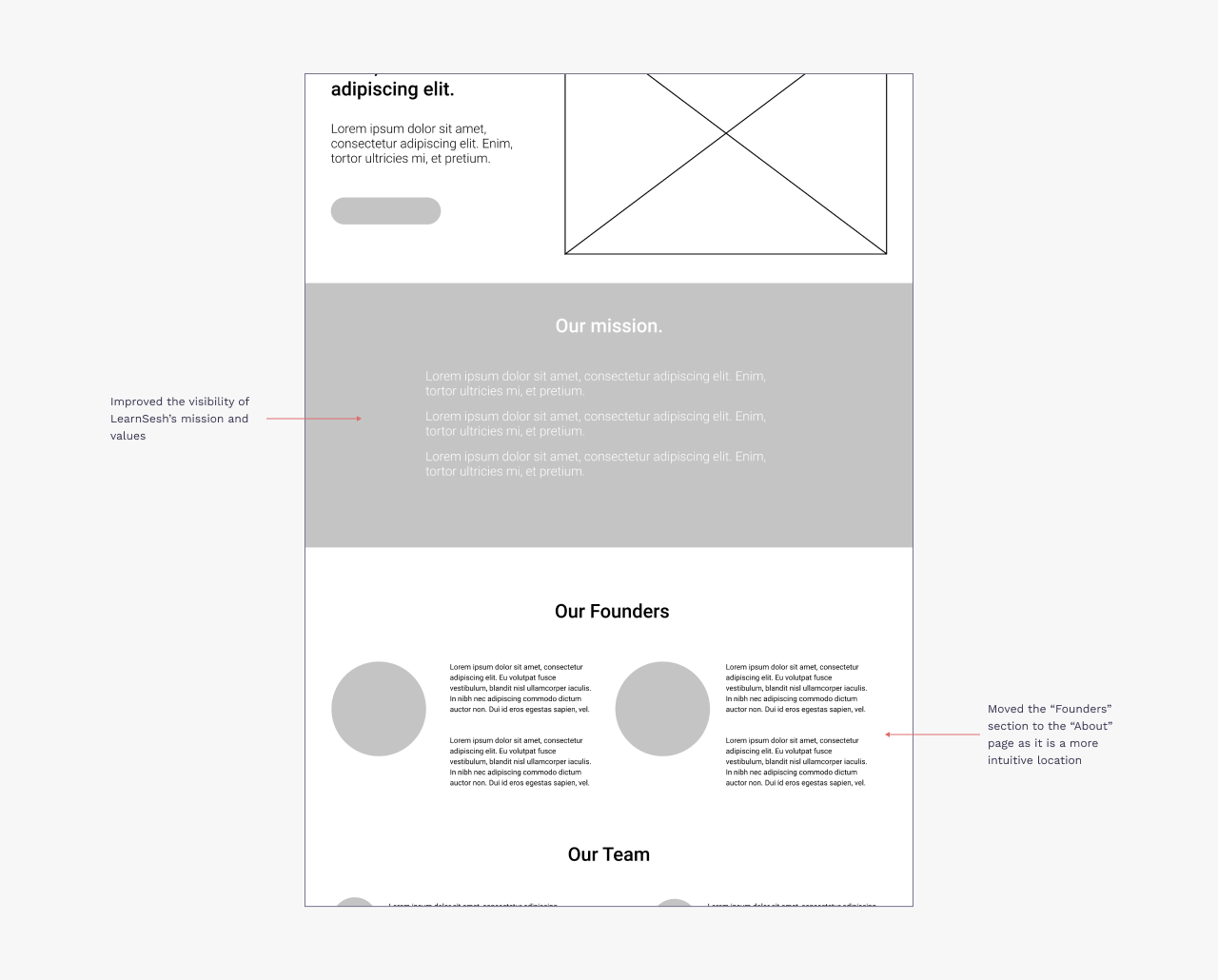
About Page
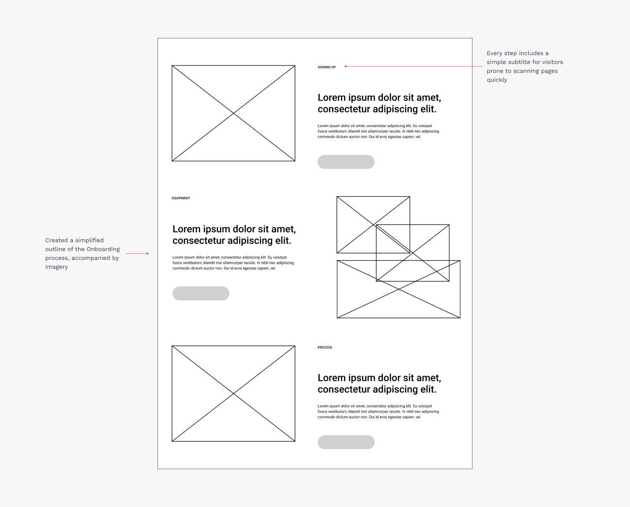
Services Page
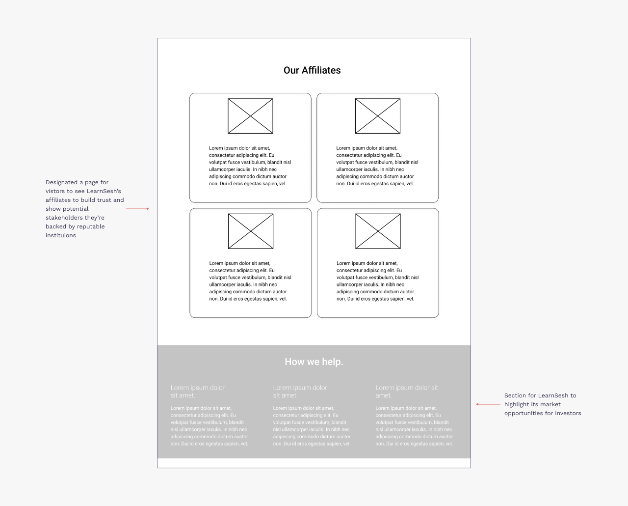
Partners Page
Final Design
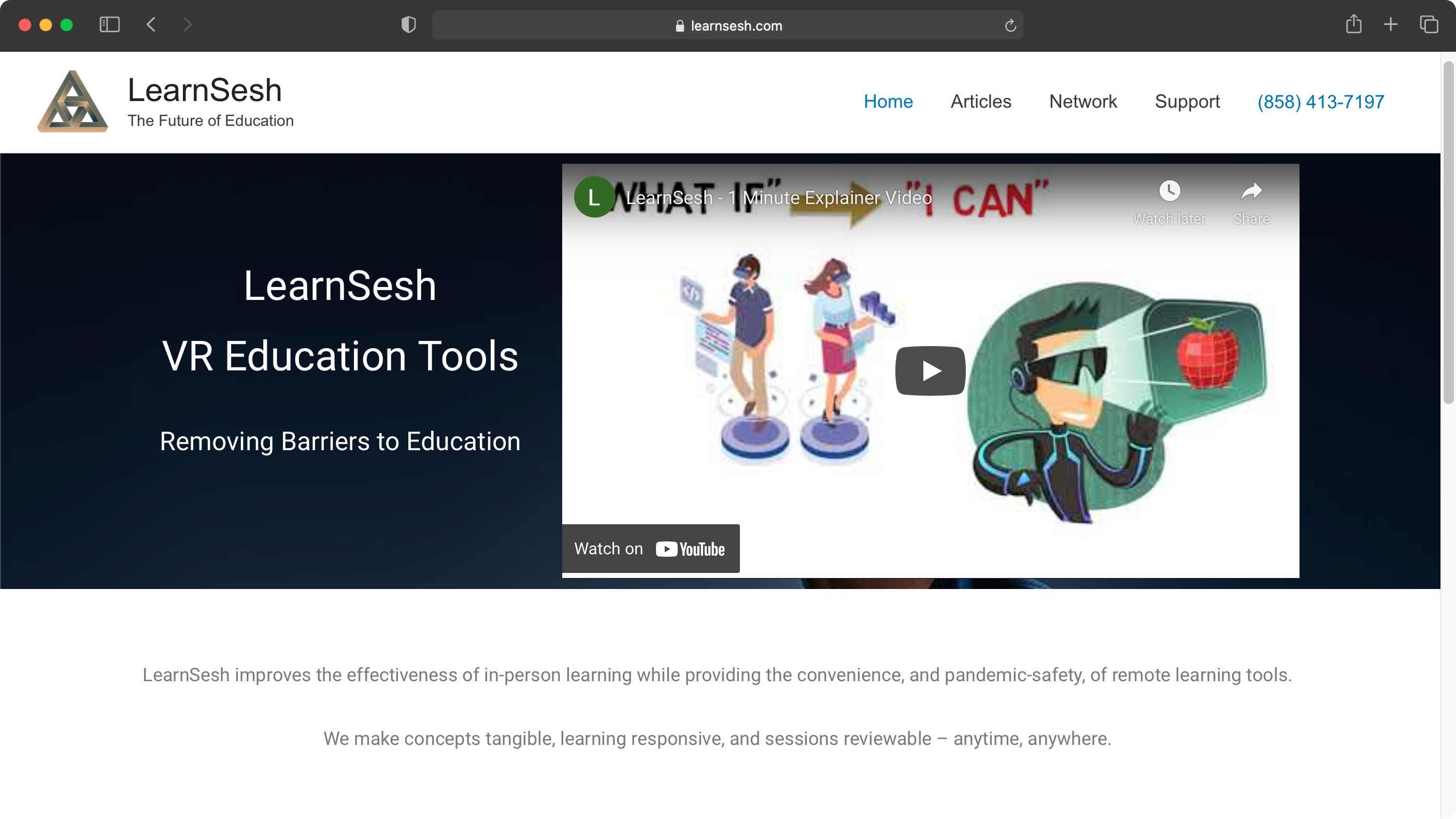
Old Landing Page
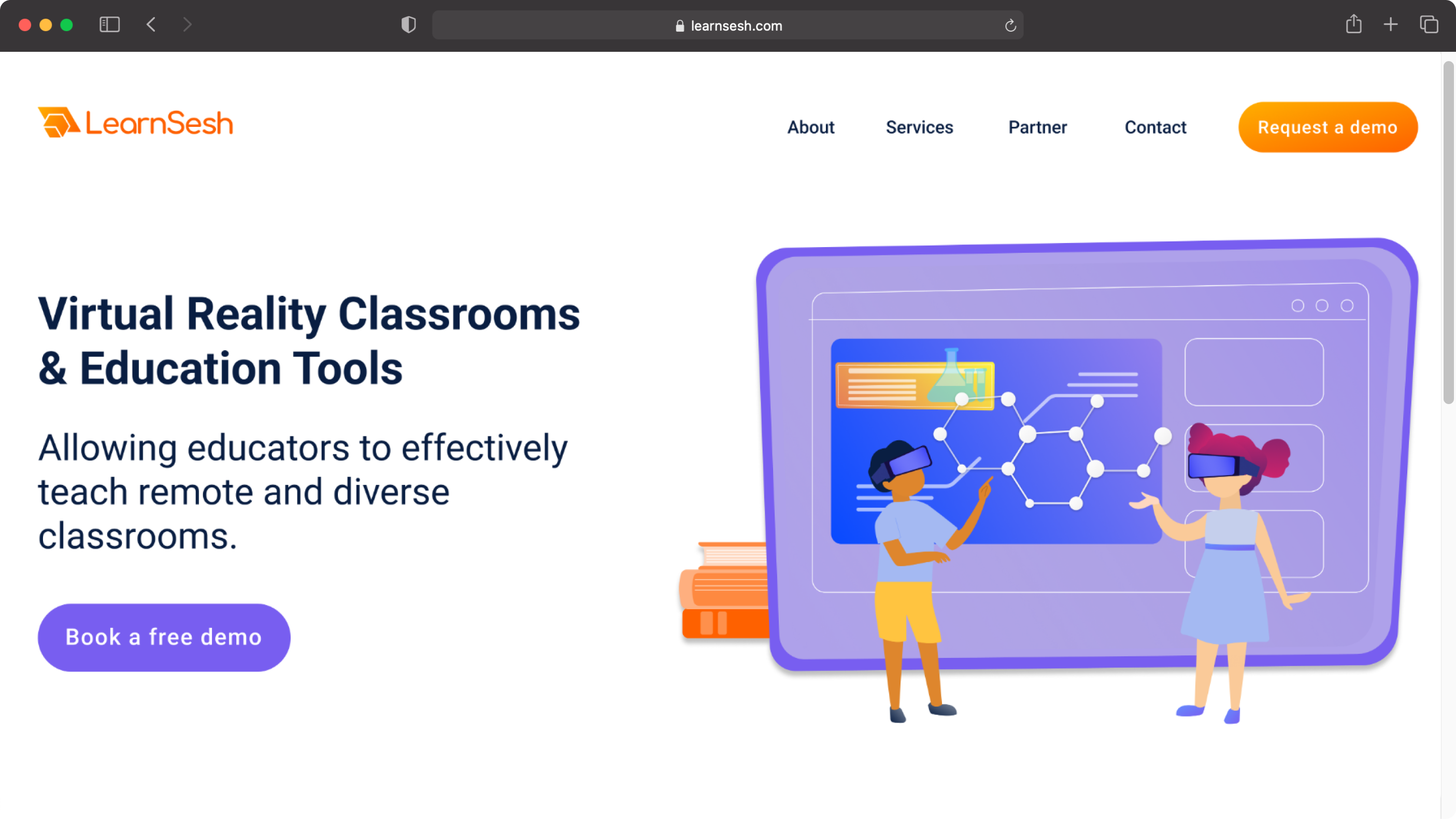
New Landing Page
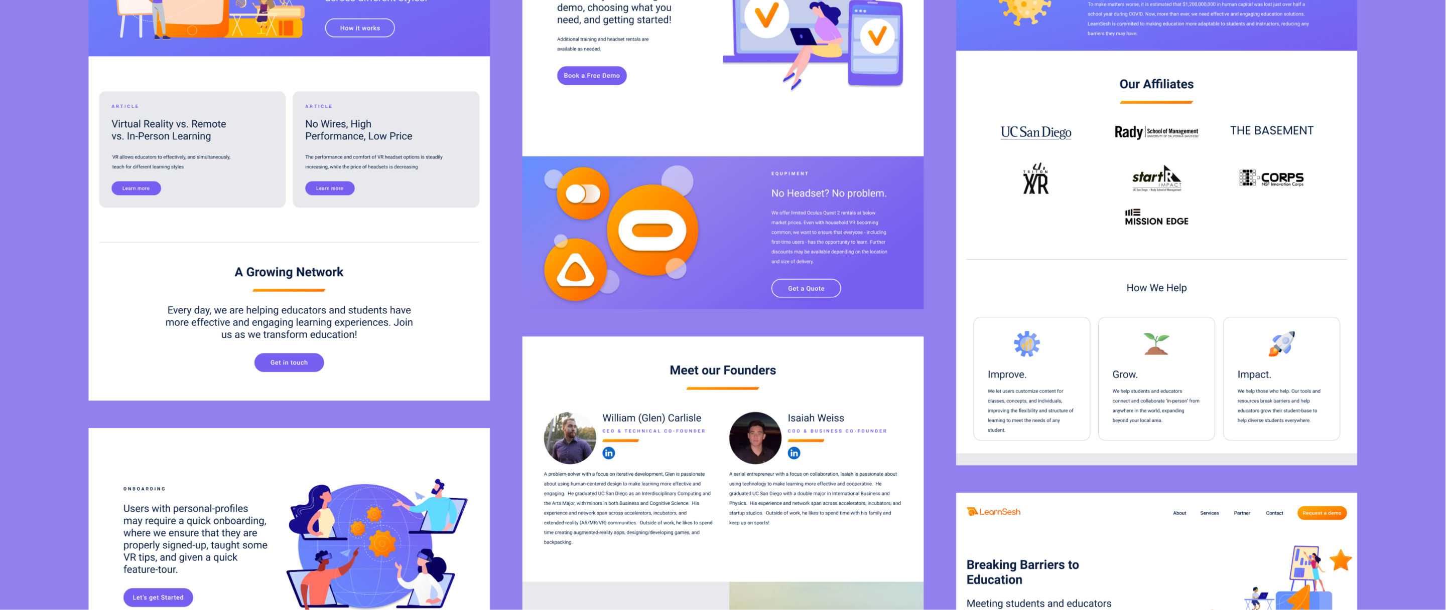
New Website
Mobile Responsive
Takeaways
This was my first time designing a brand and website for an actual company, and was a crash course to digesting design critiques. This opportunity also gave me some insight into “start-up life” and wearing many hats. As the only person with a formal understanding of design, I had to be vocal and intentional about how I approached challenges. Further, working directly with the executive team also served as a great learning experience to improve my ability to storytell and get buy-in for my designs—and when to compromise to make sure the client feels their voice and identity is reflected in your design.