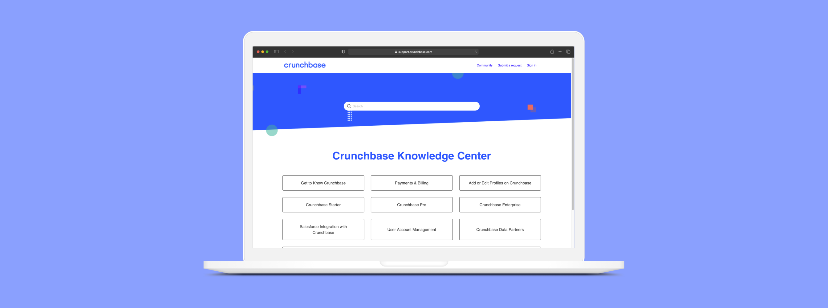
Crunchbase
Making a self-service help center more intuitive
Overview
If you’ve ever had a difficult time finding the answer to your questions in a website’s knowledge center, have I got a study for you... I had the opportunity to support Crunchbase’s UX research team as they improved the usability of their Knowledge Center.
Crunchbase is a platform that offers information about businesses and various insights — mostly financial. Although they provide a great way to search and discover companies, users were having a tough time finding answers to their questions in the self-service help center, resulting in more calls to customer support. To help them, we broke down the information architecture and reconfigured it.
Team
- Anders Herberg, Researcher
- Adoniah Carmeline, Researcher
- Claire Kim, Researcher
- Elaine Zhou, Researcher
- Jeffrey Wong, UX Researcher
Duties
- Research
- Information Architecture
- Interaction Design
Time
- Jan 2020 - March 2020
Problem
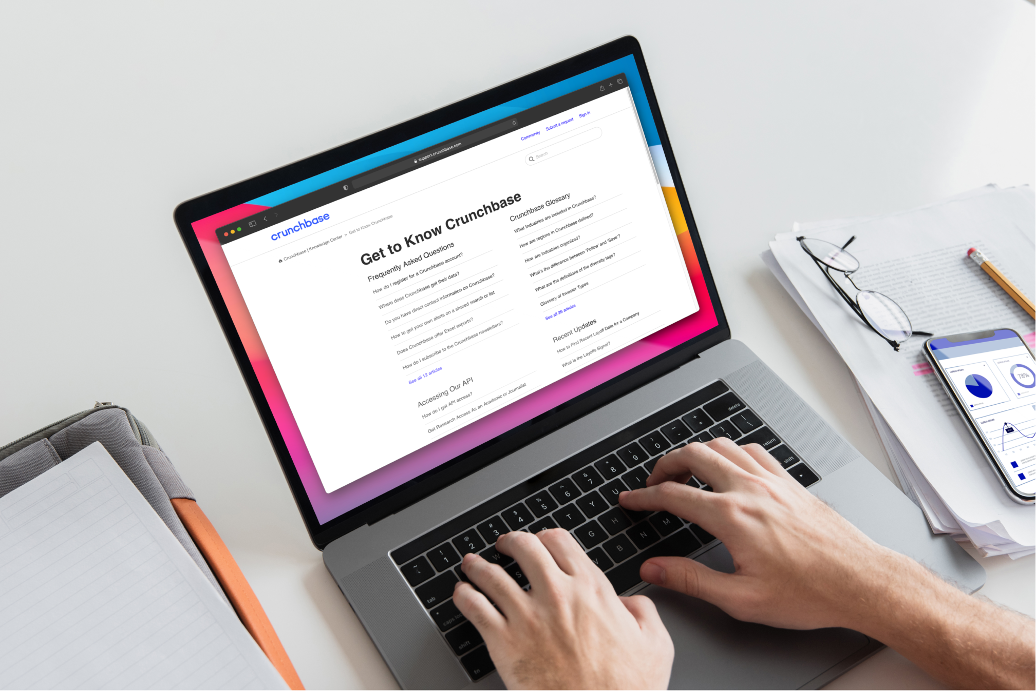
Crunchbase’s Customer Experience (CX) team was receiving too many tickets from customers regarding issues that could easily be troubleshooted via their self-service system—Knowledge Center (KC). Thus, users were having difficulty accessing the information they needed quickly and efficiently.
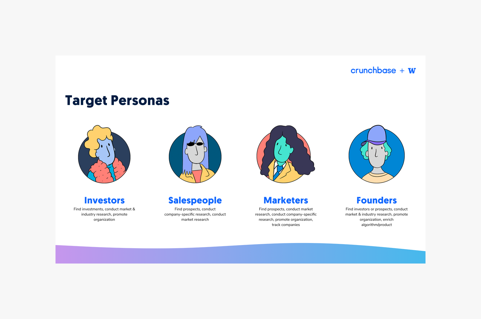
Target personas as defined by Crunchbase’s UX team
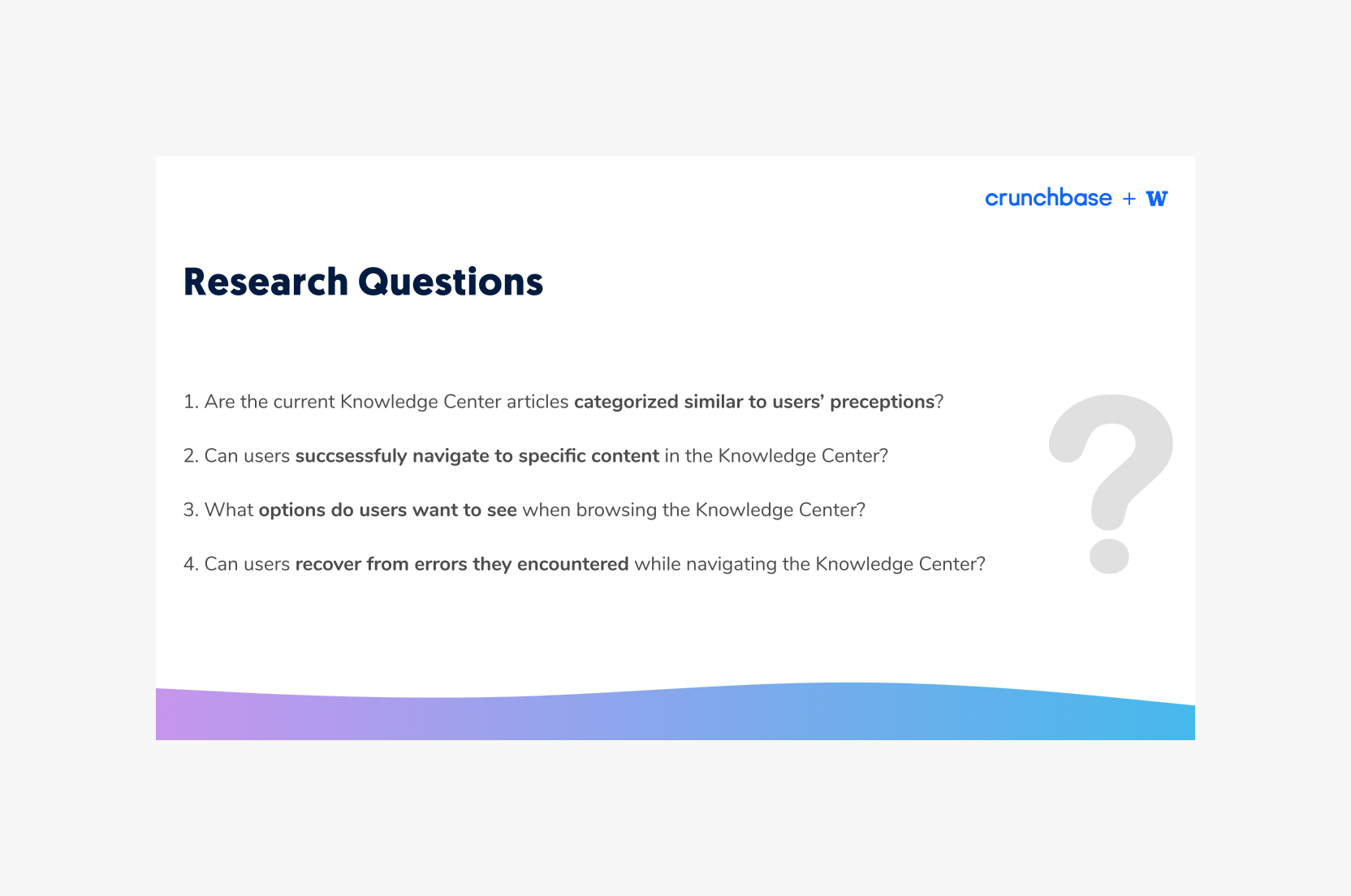
Key questions we asked to investigate the Knowledge Center’s information architecture

My team's process flow during the project
Challenge and Research
My team was assigned to assess the KC’s information architecture and generate a usability study to identify current pain points, cognitive mapping behaviors, and how to optimize the KC’s user experience.
To investigate the problem, we used a mixed-methods approach to determine the severity of user concerns. We began with a heuristic evaluation of the current KC, then recruited participants to complete a card sorting activity to determine the mental mapping of the KC’s categories and articles. Finally, we recruited participants fitting our target personas to complete a treejack test of the new information architecture we generated from the card sorting results.
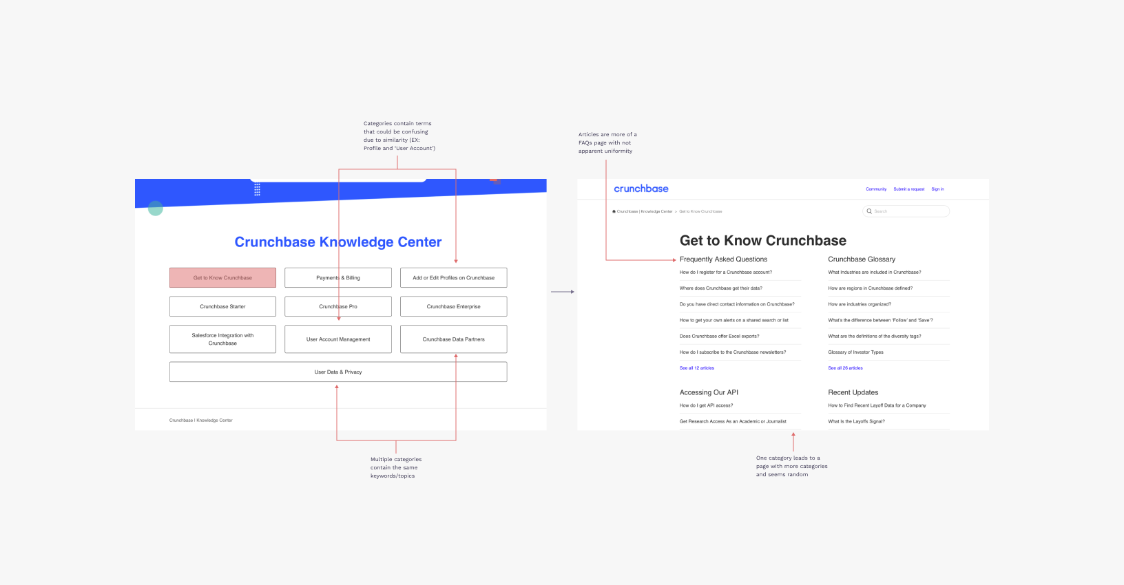
Assessment of ‘Get to Know Crunchbase’ flow and its evaluation callouts
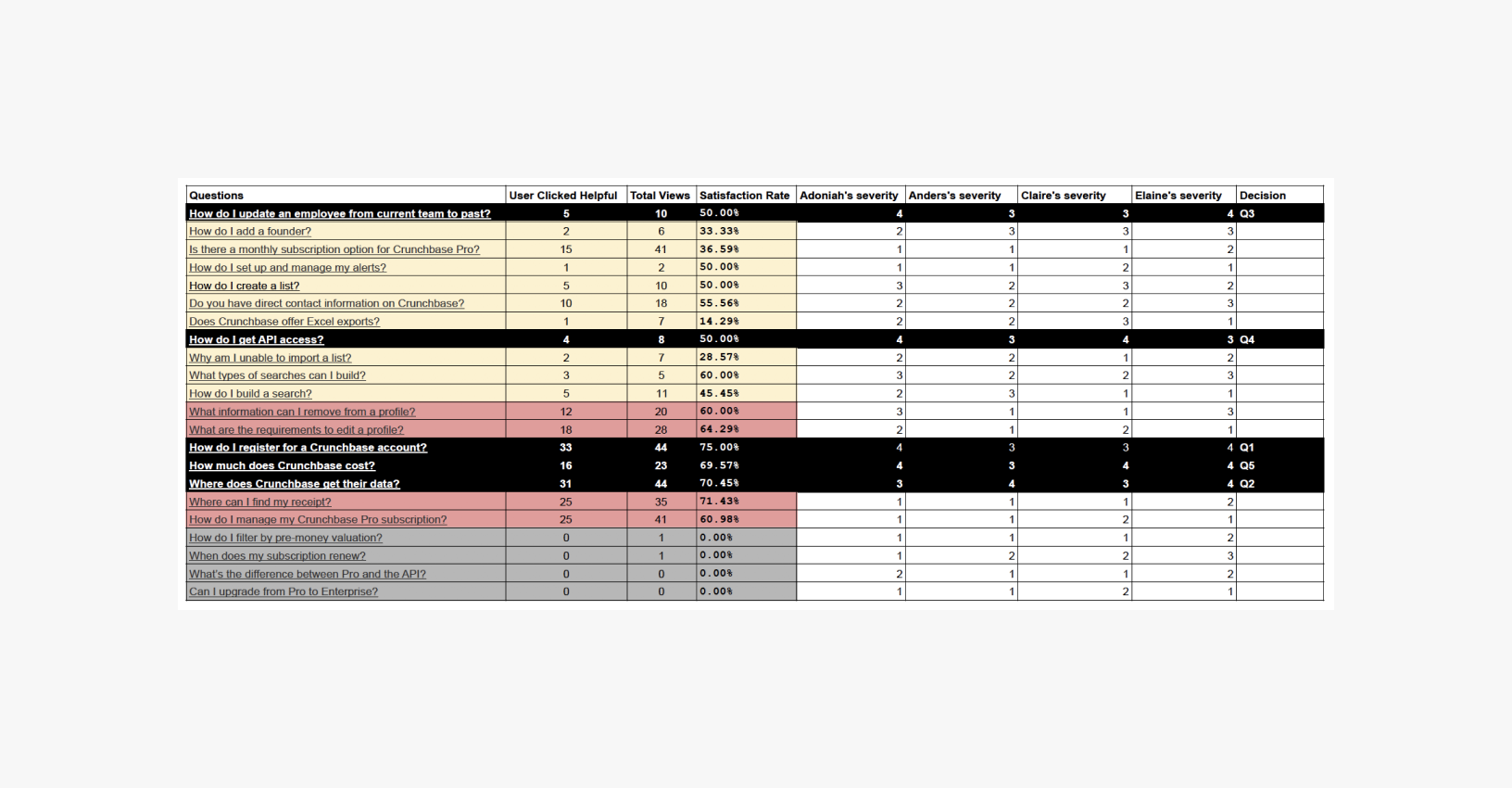
Our teams evaluation and rating of severity for heuristic violations
Synthesis
In total, we had 58 participants complete our card sorting activity, along with 7 participants complete the treejack exercise. The findings suggested the KC had room for improvement of its organization and how it labels categories.
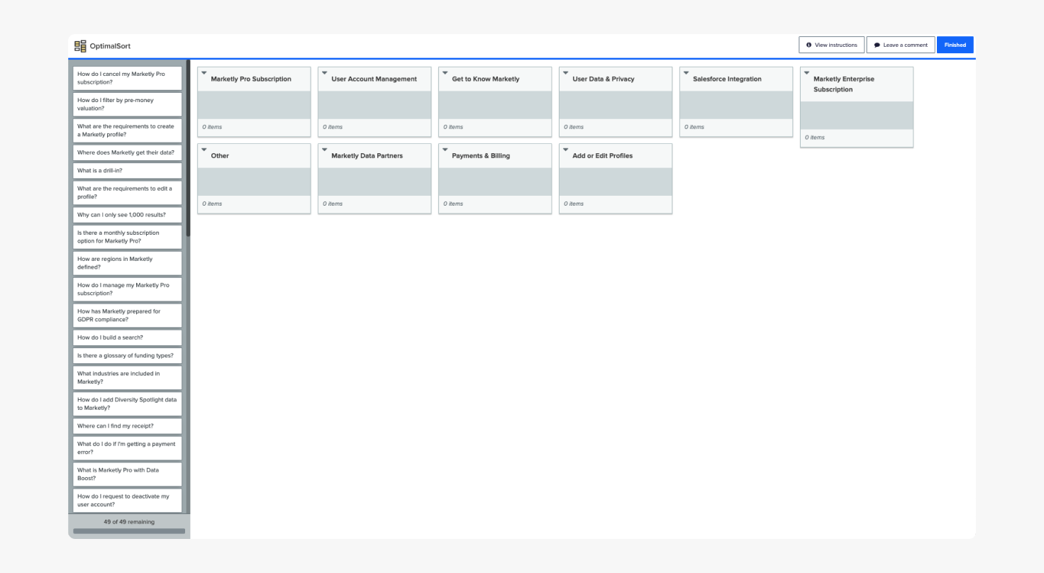
Card sort activity via OptimalSort
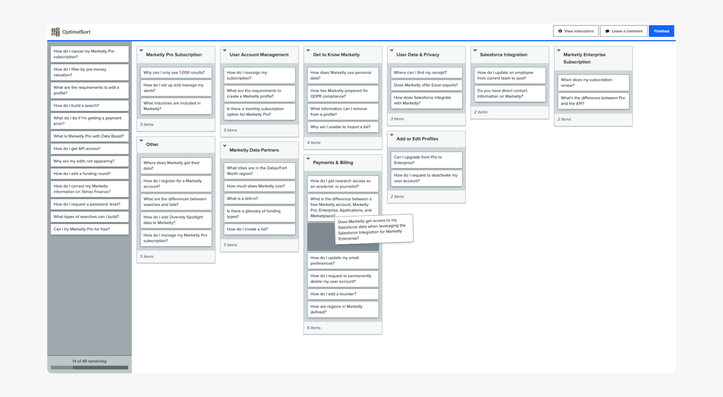
Demonstration of how participants completed the exercise
During the card sorting activity, participants organized articles to incorrect categories 50% of the time, based on the KC’s current structure. After completing an affinity map and reviewing the data, we found that participants relied on key words and terms to bundle articles into categories even when the topic of the article wasn’t relevant to the perceived category.
Conducting a Tree Test usability study with participant via Zoom
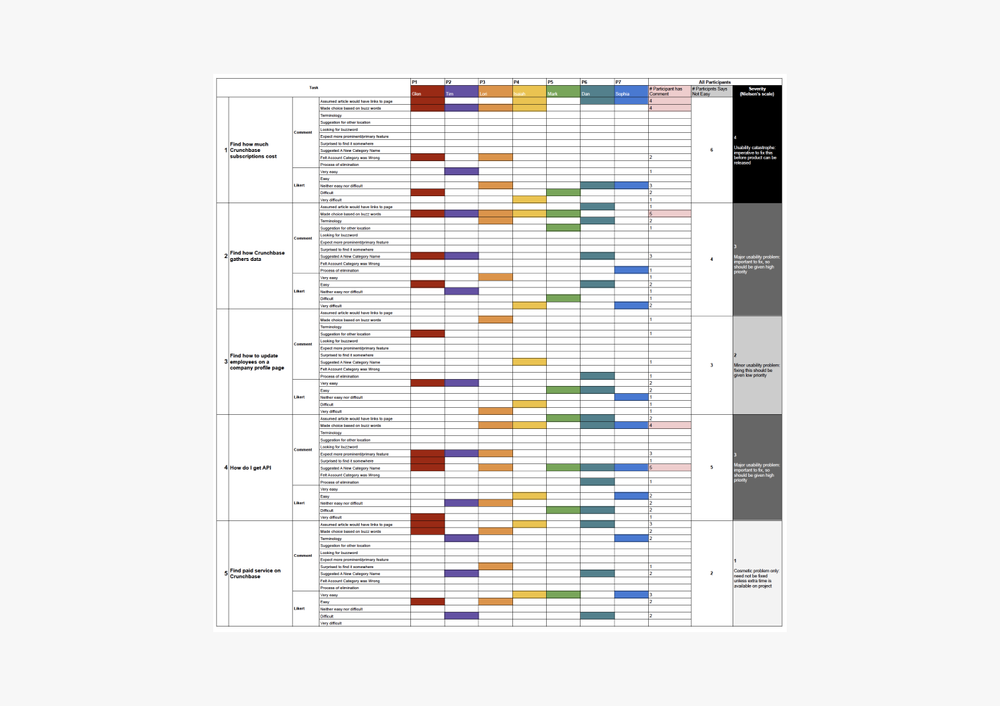
Used a rainbow chart to visualize the severity of user pain points we observed
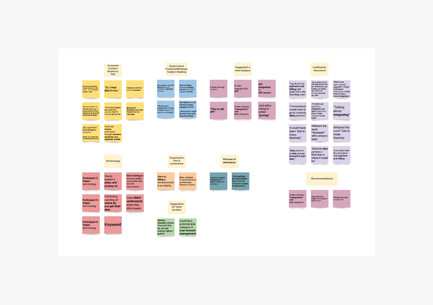
Affinity map of observed patterns from tree test exercises
Design Recommendations
When it came to interaction design, we recommended the KC incorporated more visual elements to reduce the overload of text links with similar terms and words to make concepts clear to understand. Additionally, prioritizing the most common FAQs on the landing page to offer shortcuts.
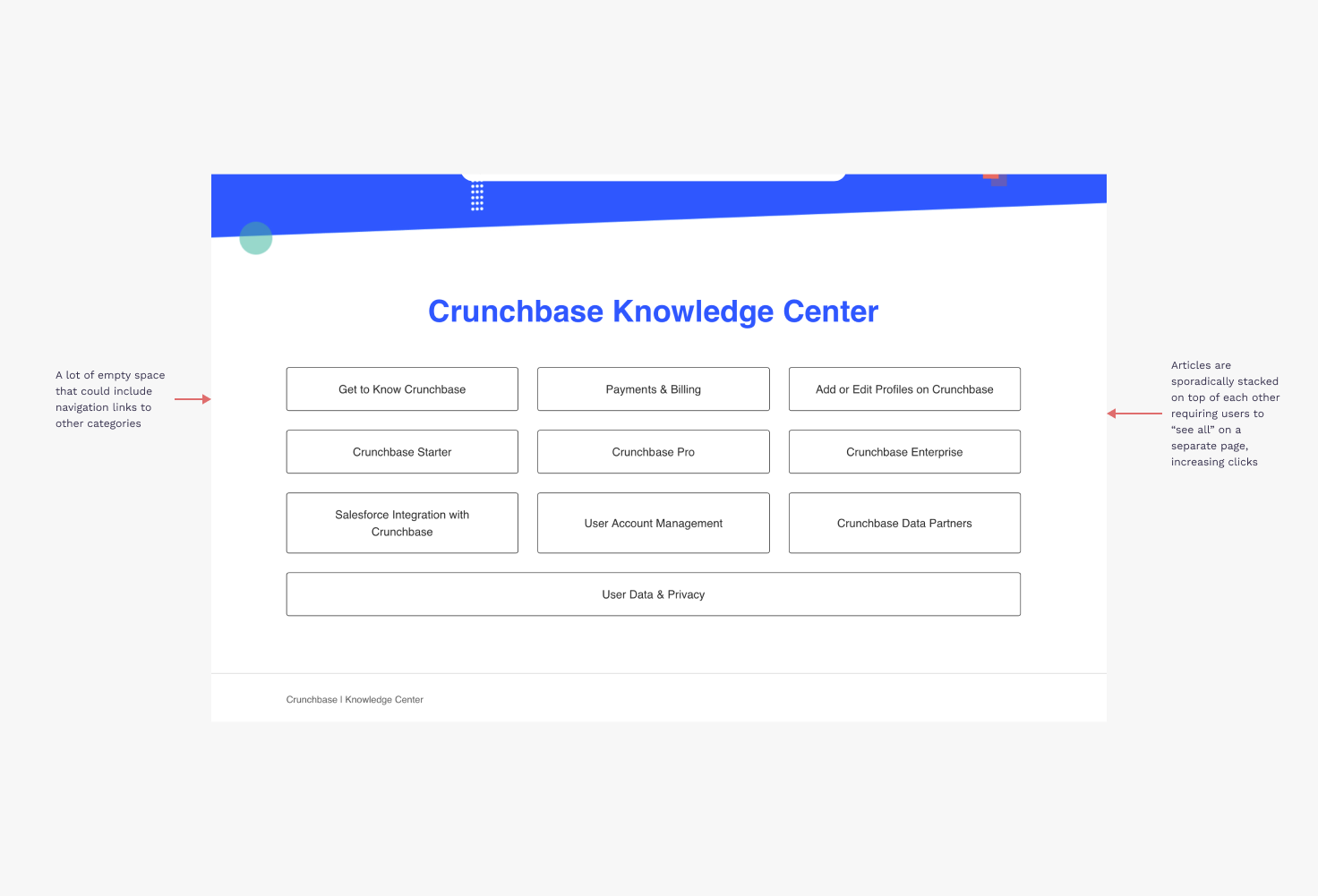
Homepage before: Buttons all looked similar and had similar titles
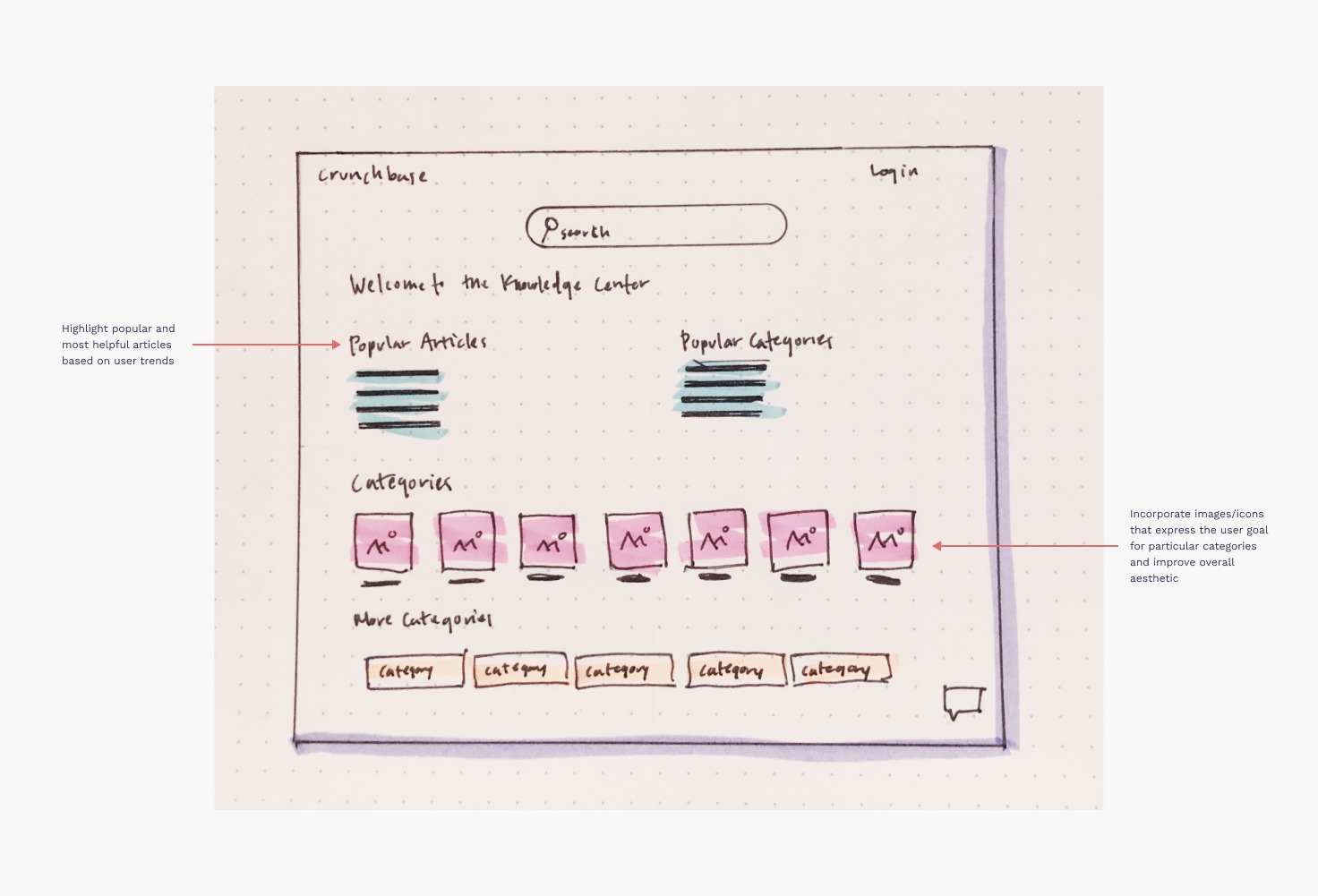
Homepage proposal: Create more separation and variety of options and highlight popular articles
Additionally, because users had a difficult time knowing what category articles were located on category landing pages, we identified potential sub-categories during our treejack studies. Sub-categories can reduce the confusion users experienced due to vague terminologies and provide a more accurate structuring to categories.
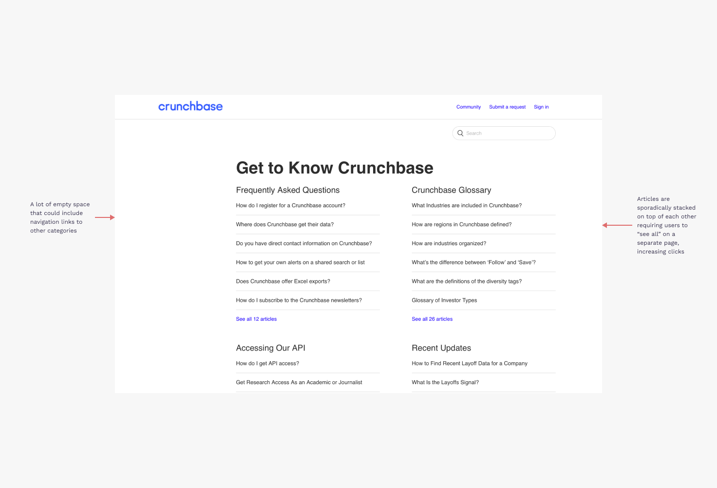
Navigation before: Stacked categories, easy to get lost in sections
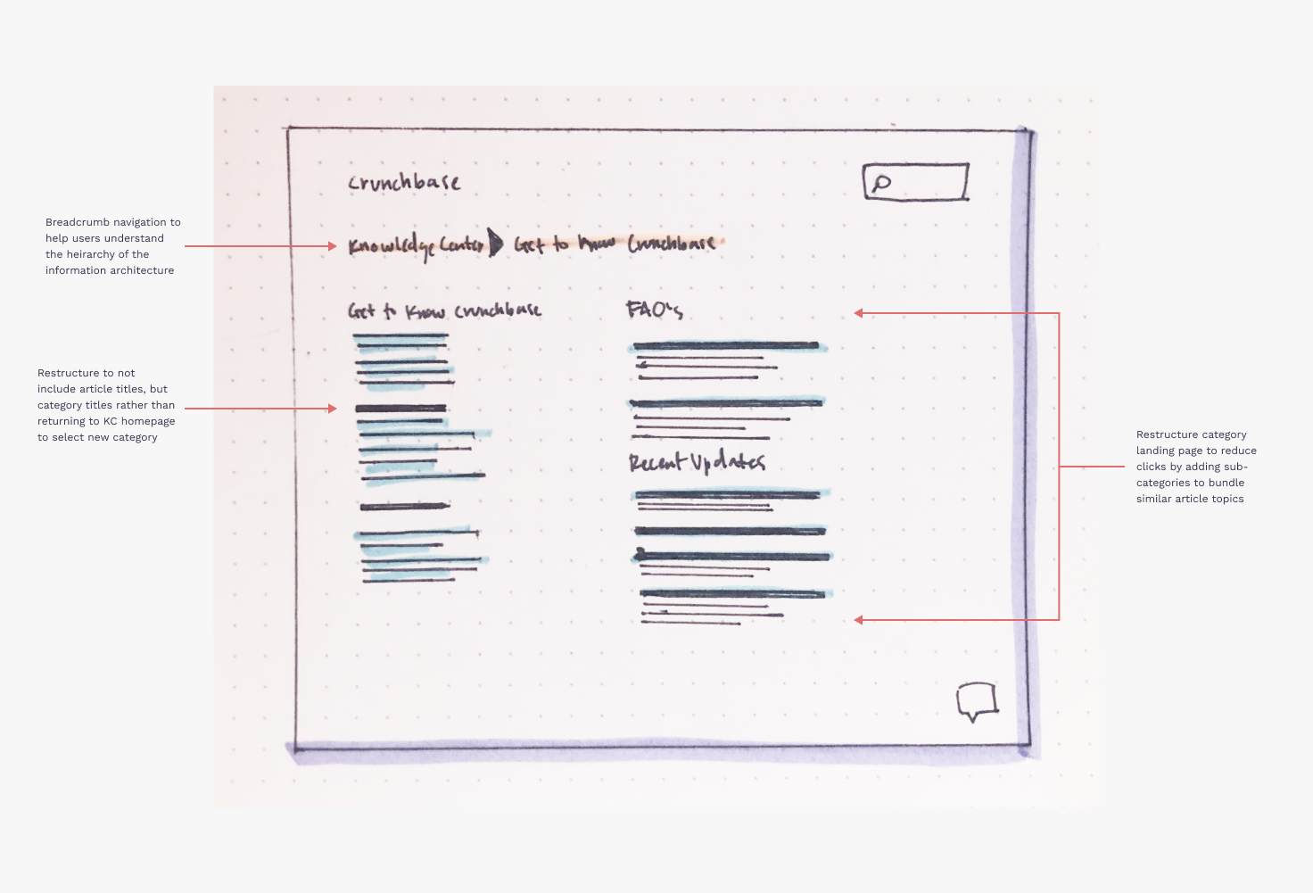
Navigation proposal: Include breadcrumb navigation to give users reference points, and create well defined sub-categories to organize similar articles
Takeaways & Next Steps
After our team presented our findings to the CX team, they took our results into consideration and implemented some of our recommendations into the KC’s design updates. This included the incorporation of visual elements to simplify sections, breaking the landing page into chunks rather than a list of items, and incorporating a static FAQs section on the landing page that allows users to quickly access common inquiries.
If I were to continue on this project, I would want to dive deeper into user habits when communicating with customer support for more data related to concerns as well as testing the actual KC page as we were limited to only testing information architecture via card sort and treejack exercises. I would also like to gather support call/chat recordings and transcripts to target specific pain points and learn more about which user personas rely on Crunchbase’s customer support team to resolve issues.