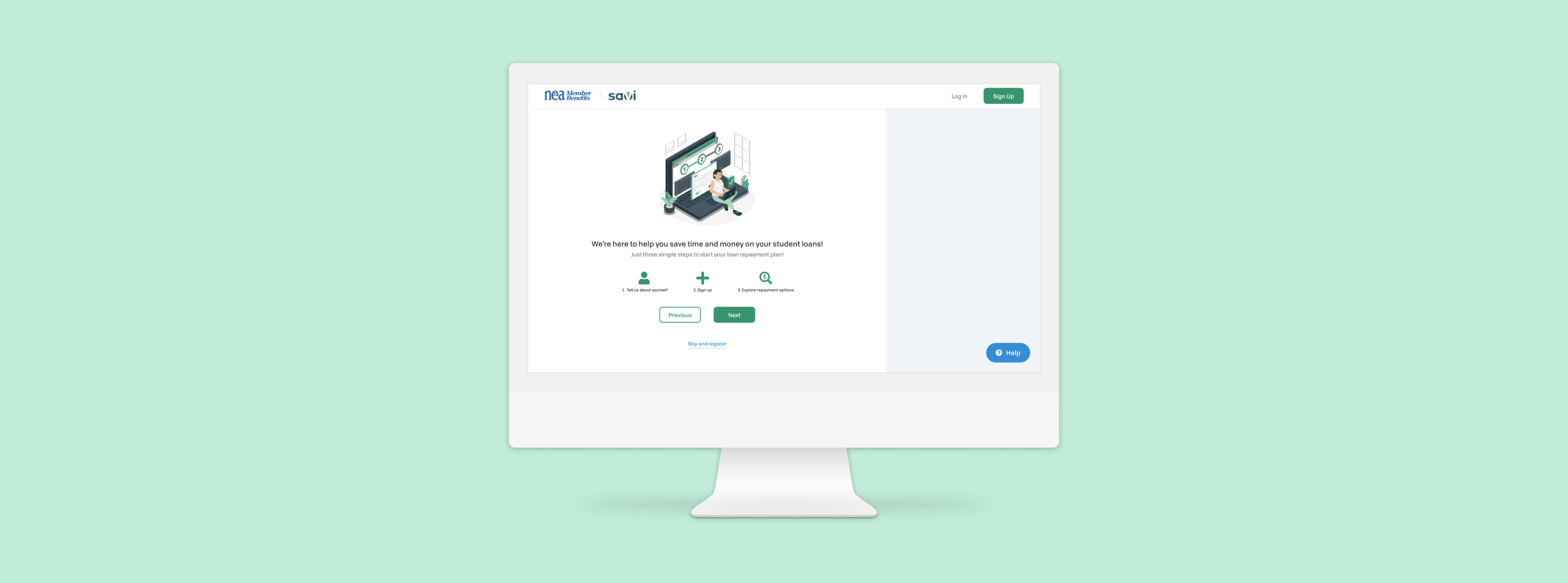
Savi
An onboarding experience to empower borrowers and increase conversion
Overview
Student loans are an unfortunate reality — I know that all too well. Savi is a subscription-based service that’s been around since 2017 and saves borrowers $150 a month on loan payments, on average. They primarily help social workers and educators apply for income-driven repayment plans (IDR) so they can satisfy requirements for federal loan forgiveness programs.
Another unfortunate reality is that many new and prospective users are not completing their registration process for Savi, and when they do, they are unsure how Savi benefits them. This is where I came in — I investigated these concerns and designed a new onboarding experience for Savi.
Team
- Meg Young, PM
- Jenn Wolfgang, PM
- Lisa Lalani, Sr. Product Designer
- Anders Herberg, Product Design Intern
Duties
- User Research
- UX Design
Time
- May 2021 - Sept 2021
Problem
During the registration process, too many prospective users were dropping off—about 80% by the time they reached the end of the process. This was impacting conversion rates and directly impacted revenue. Additionally, new users who did complete the registration process were still unclear of what Savi offered to them, and if the services they offer are right for them.
My challenge was to discover where in the registration process users were dropping off, and investigate the knowledge gaps that are present in new users beginning their journey with Savi.
Research
I used a mixed methods research approach which included reviewing Google Analytics information to identify precise areas where users tapered off, a heuristic evaluation of the current registration process, competitive analysis, shadowed customer support calls, and reviewed transcripts from Savi webinars.
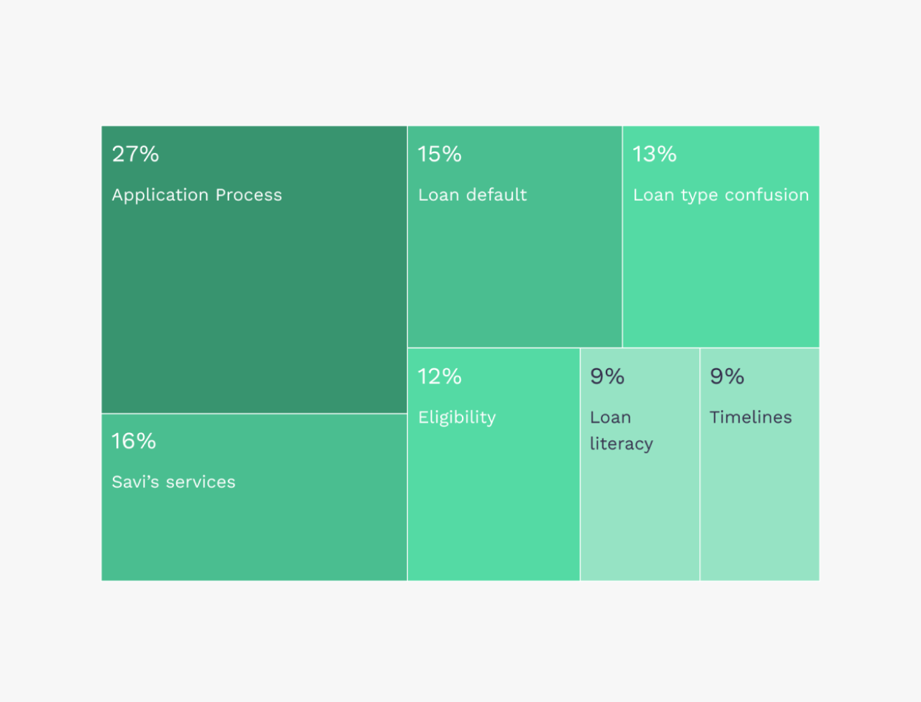
Simplified insights of concerns and questions asked during webinars
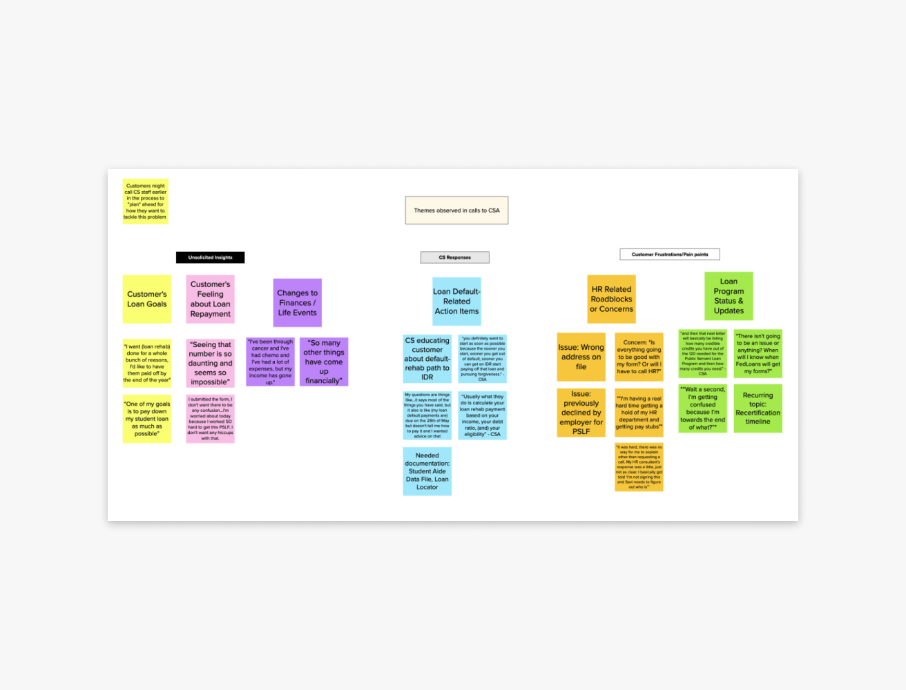
Collected insights and quotes from customer support calls with existing and prospective users
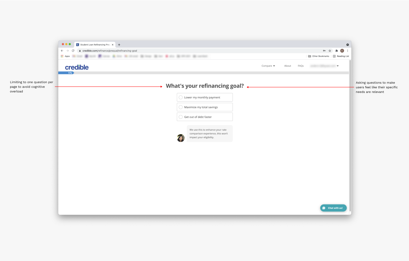
Credible.com
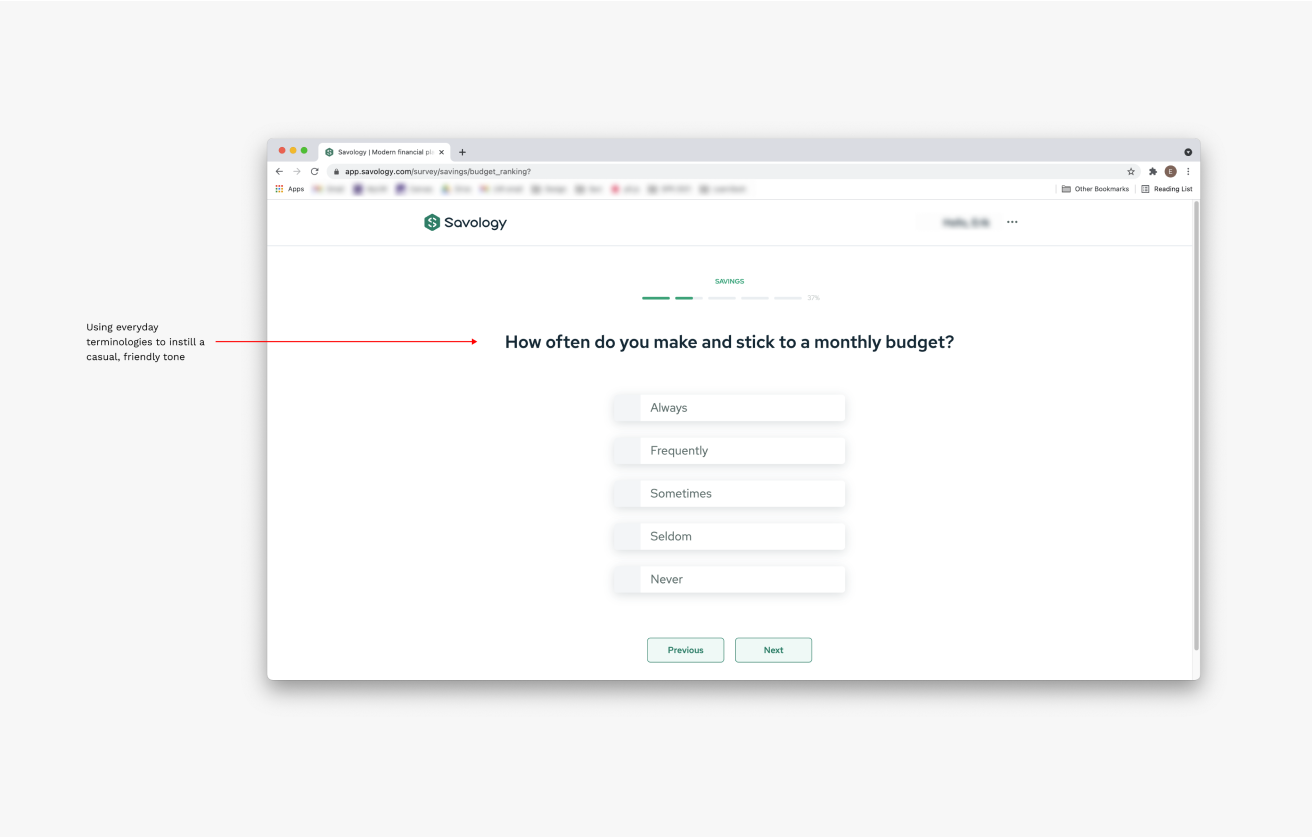
Savology.com
Synthesis
After reviewing the data, I worked with the product team to establish primary and secondary personas based on customer support callers and webinar attendees. The primary persona was Pam—she embodied a large portion of borrowers who are navigating their student loans and how it impacts their families. In particular, we identified how a parent’s student loans can affect their child from qualifying for their own loans. Our secondary persona was George, reflected more of the audience we’re trying to connect with—recent grads beginning their loan forgiveness journey.
My research's design implication was to design a new onboarding process, focusing more on educating users about Savi’s services and how borrowers can prepare themselves for loan forgiveness eligibility. I found many users were completing application processes they weren't eligible for, they were unaware of Savi’s services, and they were exhausted by the end of registration. I used my competitive analysis to justify my design decisions and help establish a new voice for Savi when communicating with prospective users.
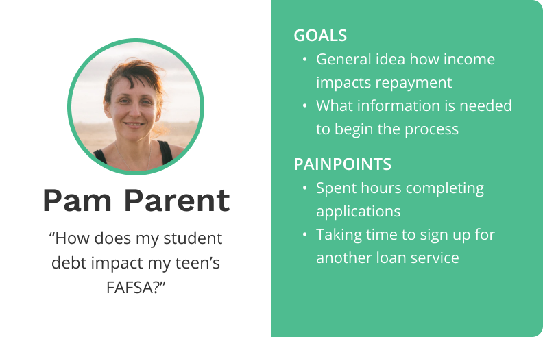
Pam "The Parent"
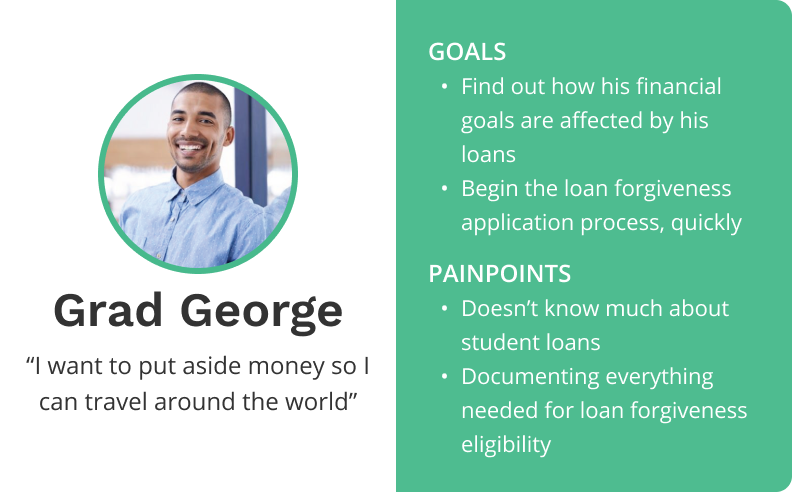
George "The Grad"
Design Ideation
After receiving approval to design a new onboarding experience, I worked cross-functionally with the Engineering, Customer Support, and External Affairs team to best identify the pain points from both the customers and internal stakeholders.
My work with the External Affairs team helped me select the copy I needed to fall within regulatory policies and to help establish a unique voice of Savi. Engineering helped me strategize where the new process could be inserted, as well as the baseline information we needed to accurately assess loan forgiveness eligibility. Finally, the Customer Support team helped me empathize with borrowers and shared common concerns that could be resolved before a call to support.
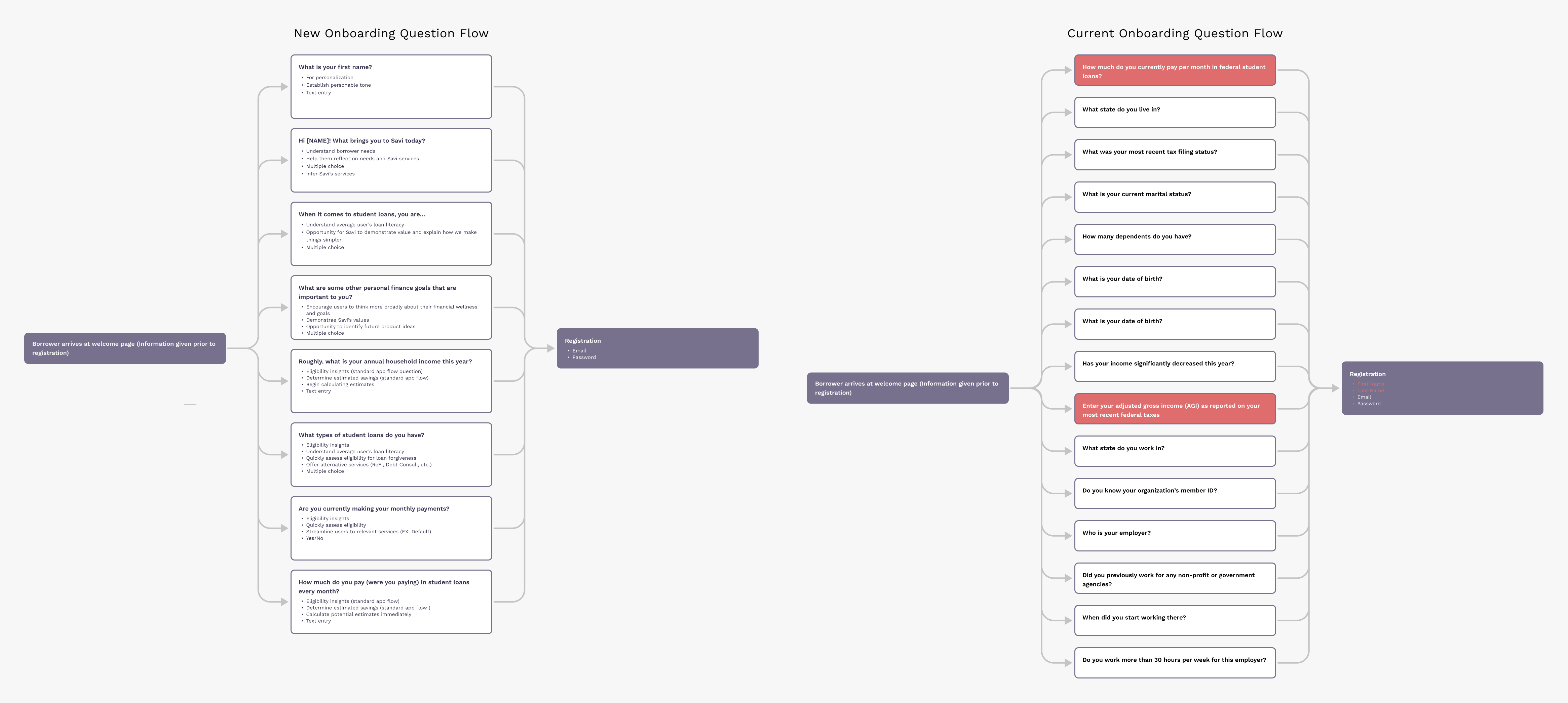
Diagramming the question flows and reasoning for pre-registration data collected from borrowers and identifying data redundancies that can be eliminated from IDR application

The new onboarding is experienced by borrowers who are members of a Savi Partner (AARP, NEA, etc.) and can only be accessed through a client port
Sketching and Wireframing
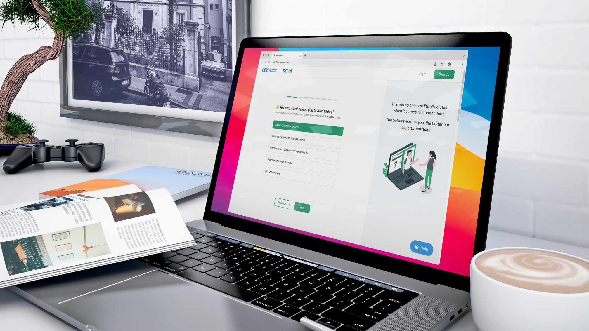
I quickly jumped into sketching and wireframing the layout and interactions. Based on the competitive analysis, I elected to have a familiar, minimalist layout with one question per screen. One of our primary goals was to reduce channel switching (i.e. being directed to an FAQ page), so it was imperative the new design prioritized pop-ups and overlays to alleviate that friction.
A key business goal of ours was to improve Savi’s ability to communicate with borrowers as a way to improve conversion, curtail the reliance on customer support and webinars to educate borrowers about Savi services, and to demonstrate Savi’s values. This required a rigorous brainstorm and collaboration with our communications team to draft informative content that aligned with Savi’s new voice.
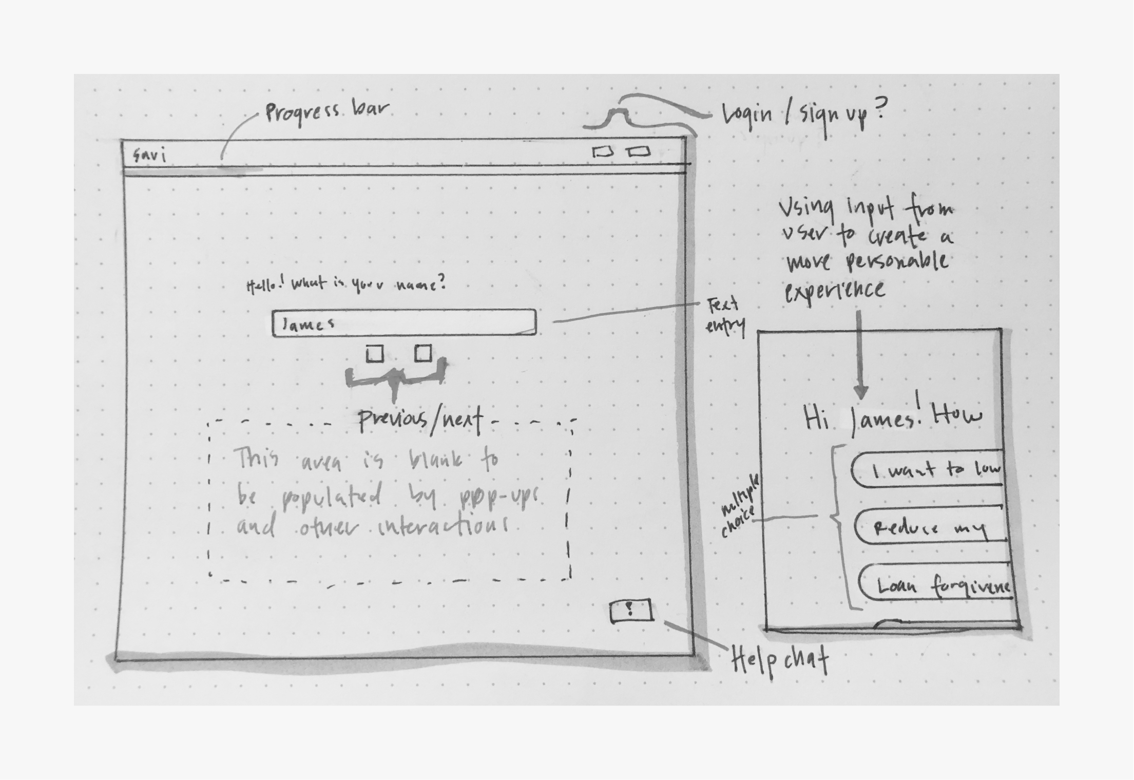
Features that allow us refer to users by name to improve personalization
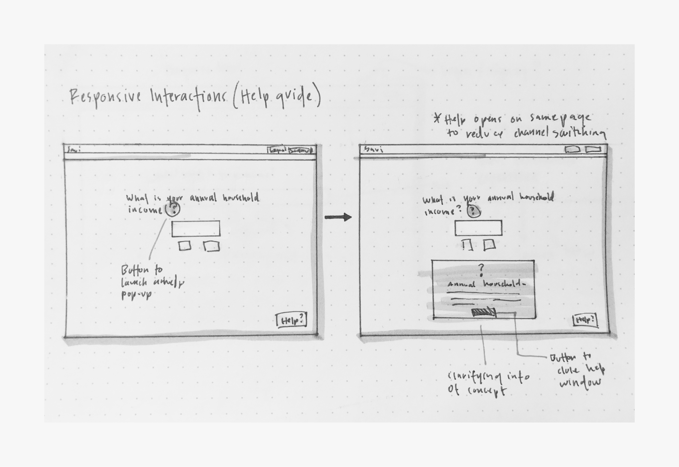
On-screen pop-ups that help users provide accurate data and make informed decisions
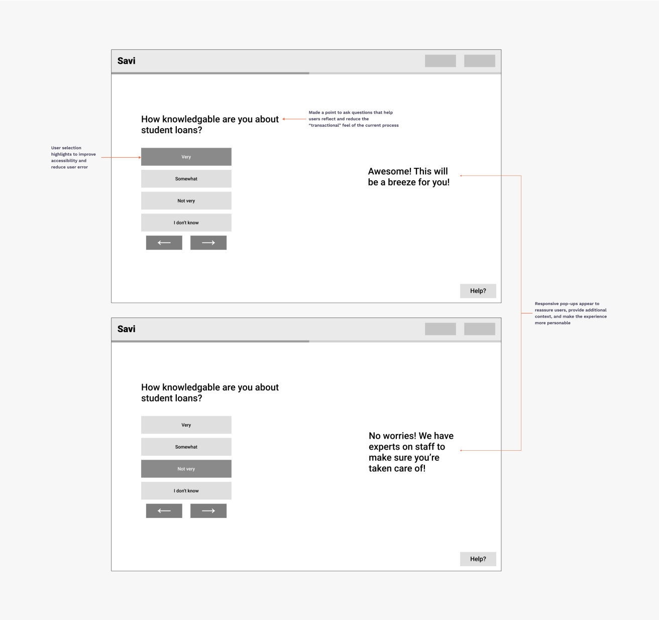
Empowering and reassuring users to motivate them to complete onboarding and register
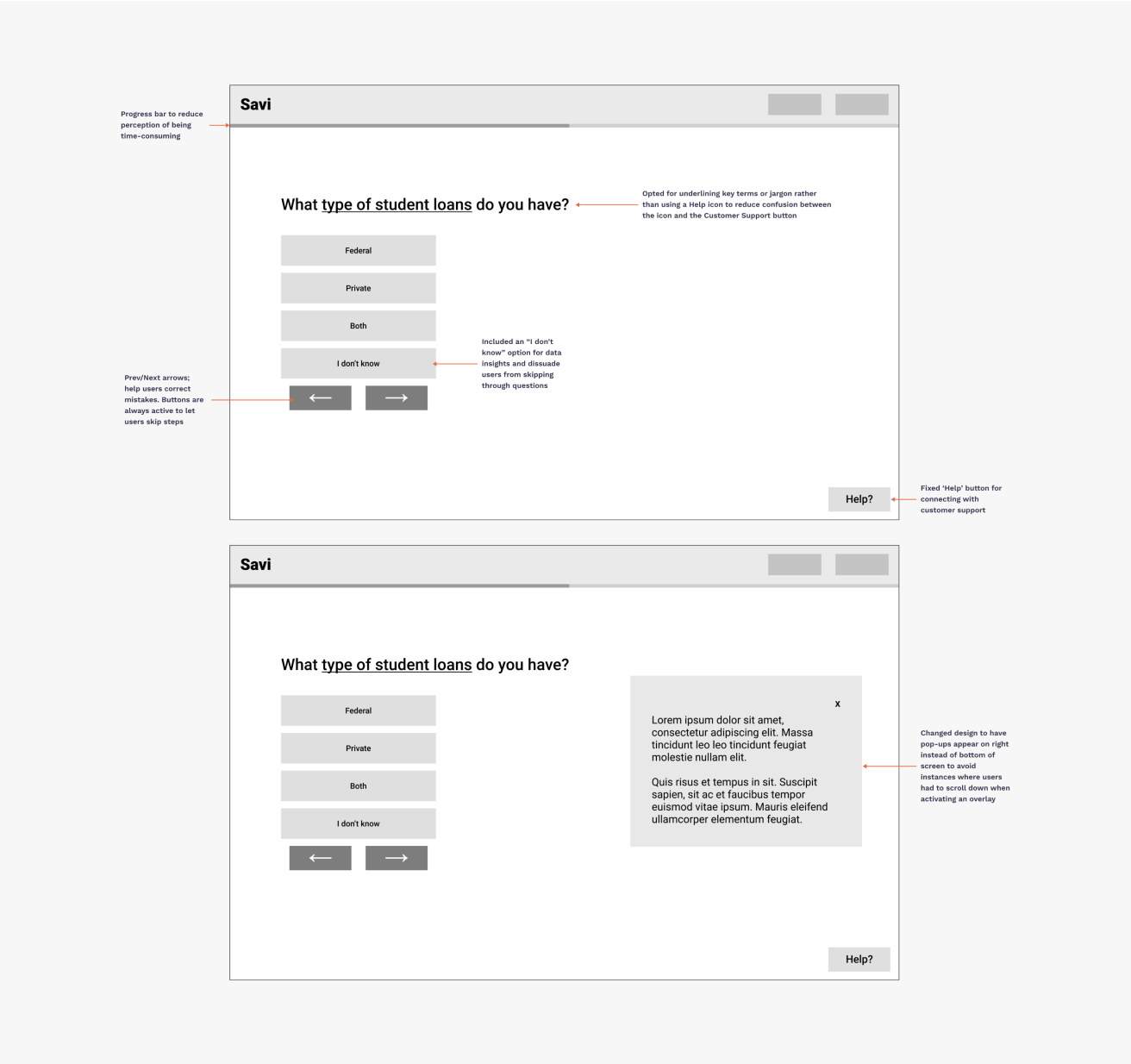
Horizontal layout design on web to view pop-ups and tooltips without scrolling
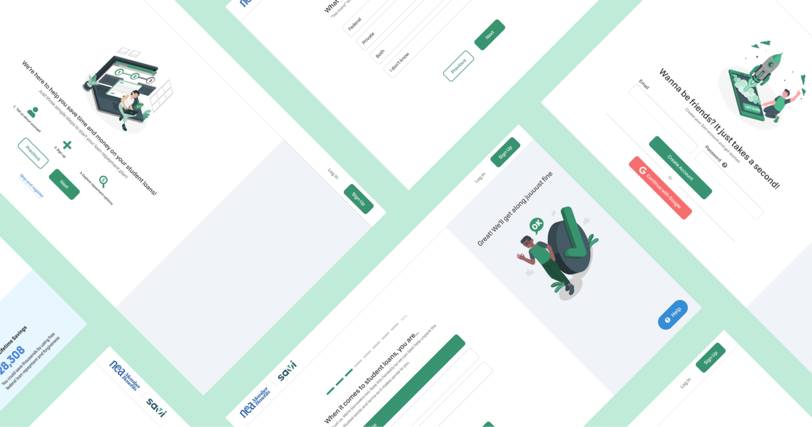
Final Design
During the final two weeks, I completed usability studies with hi-fidelity prototypes. The primary focus for the usability testing was to ensure the onboarding flow made sense to users, and gather user impressions from borrowers who were both familiar and unfamiliar with Savi.
Findings from the usability studies, along with internal feedback from Savi employees, helped me discover areas of improvement. Key redesigns included potential ADA issues, clearly outlining the onboarding process and displaying progress more accurately, and including copy that was more understanding of users who are experiencing temporary financial hardship.
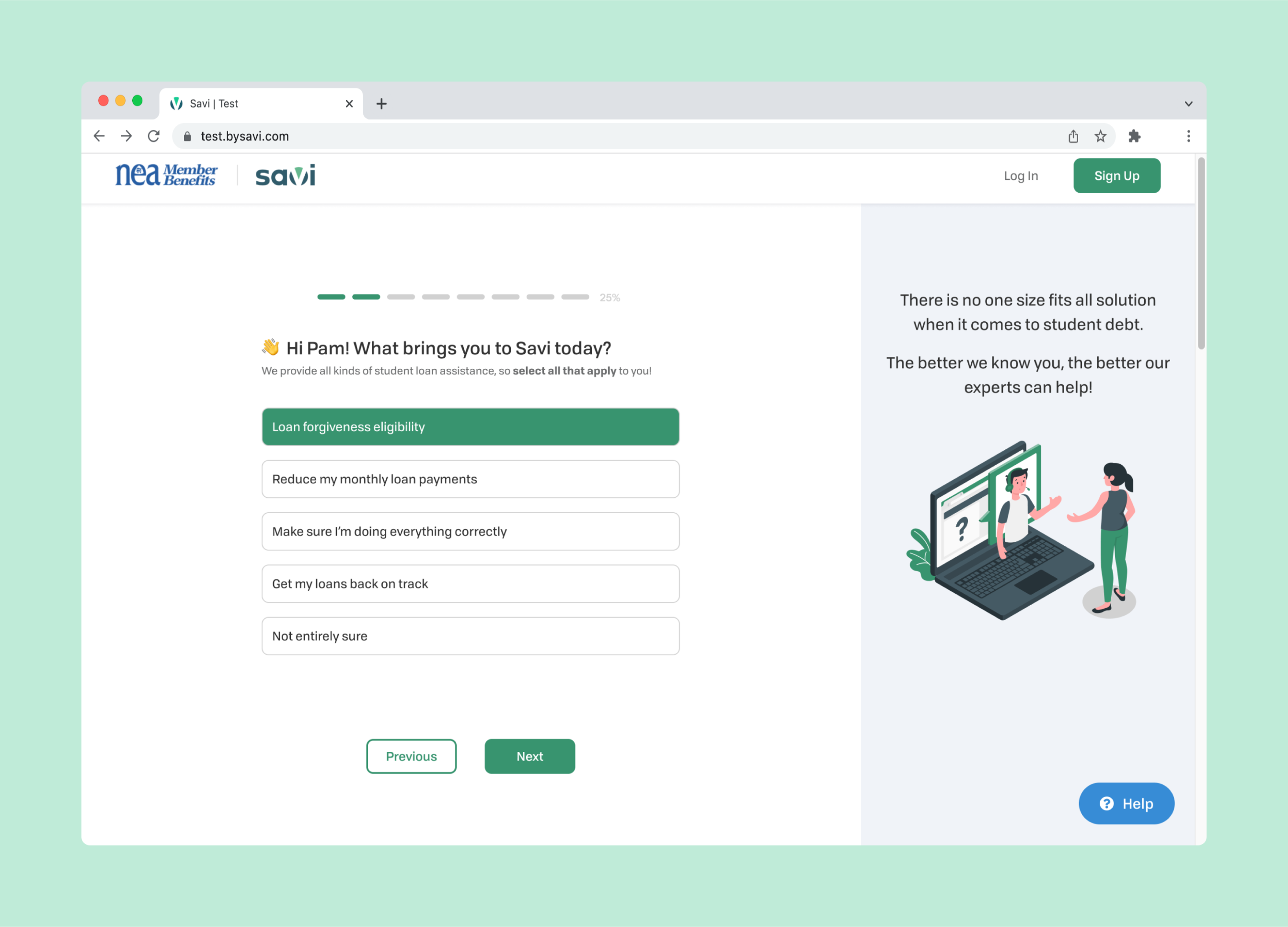
The onboarding experience is not only intended to give users a warmer welcome, it is also a way to reduce call volume to customer support by giving users a better idea of Savi’s services, and also helps Savi collect data that gives insight to future product direction. Savi is in a growth phase and having a holistic idea of what leads users to investing in Savi can make their product more dynamic by offering relevant services based on user input.
Making borrowers feel welcomed
Letting them know we’re here to help
Making sure borrowers don’t get hung up along the way
Celebrating the little wins
Takeaways
My experience at Savi was challenging and exciting. I had the opportunity to work on a blue sky project where I lead an end-to-end design process. I learned how to discover and frame user problems while considering business needs.
Feedback from employees was very positive and members of the customer support team were excited about the idea of having the data collected during this experience available to them on customer profiles. With this information, they could have clearer direction when entering a call and identify which offerings are best for the borrower. Moreover, it was fun to contribute to the new voice and brand identity that Savi is aiming to achieve.
Most importantly, this experience showed me the importance of UX research, recruiting and running usability studies, and working with engineering teams to articulate design vision and rationale. It was fun to discover where our problems intersected and explore solutions together.